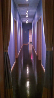
 While incorporating my knowledge & experience of environmental & color psychology along with the art & science of color I have successfully changed the profile and image of my most recent and current contract projects. Pay attention homeowners - your home should be designed with the same principals and elements. 1. Sound Stone Massage & Spa (Crestwood, MO) relocated to Watson Plaza. The owner built out the space from the ground up. With the perfect color palette situated on a high gloss black floor this space has redefined Spa design. Rave client reviews call the space “refreshingly calm”, “oh so full of comfort”, “the spa you haven’t seen before, oh my god it has color”, and “can’t wait to come again and again”. Since moving into the new space Sound Stone has reported record increases in revenues in both services & retail product and, a marked increase in return clients, the heart of any successful business. Entering the Sound Stone lobby clients immediately feel the energetic calmness and are drawn into the dreamy moonlight Iris colored hallway - calming the mind, body & soul. My favorite colors: Pantone’s Apple Green and Sapphire Fog. 2. St. Louis Area Food Bank (Bridgeton, Missouri) was in need of a major color make over. The color programming project was quite exhilarating for this color analyst from the get go. Intense research resulted in the Food Bank’s color palette being more than “food for thought”. Much was considered in developing the color palette: mission statement, logo, function & productivity of staff & volunteers, space plan & flow, and of course existing finishes that could not be changed. The seventeen selected hues reflect the goodness of the earth; the nourishment of the food it produces and the energy of the sun and rain needed for survival. Once the project is completed everyone - from volunteers, to staff, to executive board, to corporate donors – will experience the Food Bank and its generosity in a different “light”. My favorite colors: Sherwin Williams’ Kind Green, Portobello, and White Truffle. 3. We often create a blind color eye as we grow accustom to our ailing space. A dermatologist’s office at Missouri Baptist Hospital (Town & Country, MO) is getting a shot in the arm – a total color infusion. The color programming for this space includes blending fifteen rooms with ten different functions all centered around the existing carpet, VCT tiles, and laminate cabinets – none of which coordinate with each other due to the different timing of remodel projects over the past 10 years. This current recoloring project will change the cold blue-gray space into a warm flowing space by adding tans, warm greens & blues – yes cool colors can be warm. Waiting patients will be treated to a reception room that makes waiting less painful. The exam rooms will be less sterile and the staff work stations will be worker friendly. The hallway wallcovering will coordinate with the floor, leading staff and patients to their destination with reduced glare from the overhead fluorescent lighting. Favorite colors: Sherwin Williams’ Sand Dollar and Contented. 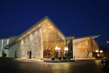 4. Think theatre makeover. The 1969 Mark Twain Theatre (Sunset Hills, MO) was called a cinema treasure seating 968 patrons viewing a sixty foot wide by thirty foot high wide angled screen. An article in Box Office’s March 1969 industry journal describes the exterior of the structure. “Wide flung wings of white stone, a soaring roof, …and an entrance defined by white stone planters keynote the structure.” Think The Jetsons. The theatre closed in 1986 and reopened in 1990 as The Two Hearts Banquet Center. Two Hearts closed its doors to their last wedding reception in October 2012 at which time a new tenant emerged. I am thrilled to be part of the team converting the banquet center into the general offices and banquet facility for the Local Laborers’ Union 110 – Labor International Union of North America. The Zwick & Gandt Architecture firm is working through the architectural programming as I develop the color programming for the interior spaces. I have always loved a great challenge. Try this one on for size – transforming a 1960’s retro structure boasting strong intersecting geometric lines into a gathering space for a group of hard working beer drinkers and a dressy evening crowd sipping fine wine. The challenge is respecting the building’s bones, reinventing its past for today’s inhabitants’ function and styling. Here’s a sneak peak - the color palette starts with the hues of Meramec River pea gravel (the aggregate found in the Laborers’ concrete work) grounding the white of the soaring limestone walls. Work in progress.
0 Comments
Leave a Reply. |
AuthorGeri loves to consume color through art, architecture, photography, and interior spaces of all built environments. She is a museum enthusiast. Exploring new places, cultures, and restaurants will always be a part of her life. Geri loves the creative process of cooking with natural fresh local ingredients and adores the beauty of colorfully plated food. 
Archives
July 2021
|
 RSS Feed