|
Foundation paint color can improve the appearance of a home, increase it's financial curb appeal, and give neighbors a prettier sightline. Foundation paint color can also distract by taking the focus off the house sitting on top of it. After all, isn't it the bride we're looking at and not the ushers? The foundation is rarely a featured element so let's not highlight its nothingness. There is a method to reduce the decision angst. Start my selecting a hue already in the existing exterior palette. Adjust the LRV (light reflective value) that will visually support the palette above. Remember, darker on the bottom. Consider the appearance of the chosen color against the surrounding hues - landscape, lawn, and the sky above. Yes, the sky. Coordinate your exterior palette the same way you select textiles for living room furnishings. Put all the hues on the table. Do know that your neighbor's house, if in sightline of yours, will affect the color appearance of yours. The end result of a proper color choice is the appearance of a larger, higher valued home. You're simply not cutting it off at the knees. And, with the structure gracefully unified the landscape can shine in all its glory while accentuating your home. left: chosen hue forcing all kinds of visual clutter, hot mess right: better hue declutters the property, highlights the home and the landscape
0 Comments
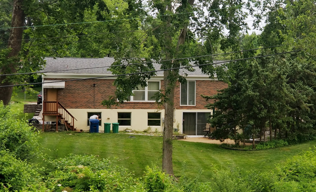
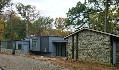 Discussing color selection for a home's exterior is always significant. This 1967 distorted mid-century home was no exception. The homeowners have taken on the task of general contractor, laborer, designer, and bringing in specialists as needed. Struggling with some key color decisions I was invited to assist in the process. The new floor plan takes advantage of extensive floor to ceiling windows across the back. Stepping into the split-level foyer the feeling is reminiscent of the garage in Ferris Bueller's Day Off. The rear of the house is set high overlooking the pool, the wooded distance, and the expansive sky above. Inside we chatted about interior window and trim stain. We coordinated the existing finishes (stone fireplace, stone wall, walnut accented walls, wood ceiling, wood beams) by selecting a deep hue to frame the massive collection of soaring twenty foot high windows allowing the sight line to move quickly to the outdoors. The wood floor was chosen purely for a biophilic design principle - don't screw with Mother Nature. Laying just outside the floor to ceiling window, adjacent to the enormous stone fireplace, lay the seasonal ground cover, dried leaves in an autumn blonde hue. Done and done. The new wood flooring, repeating the highlights of the stone, would be the same blonde hue running throughout the house acting as the catalyst for everything organic. In the kitchen I was curious about the excessive amount of 6" LED surface mount fixtures on the ceiling - I mean way way too many for the average kitchen. My puzzled face drew a response, "We shoot YouTube cooking videos and need a ton of light". OK that made sense. And, since each light will be individually controlled by a phone app the video chefs created theatrical stage lighting for their home kitchen. Back outside we reviewed the existing elements: the phyllite stacked stone, the vertical siding, and the "outlines" - window frames, door frame, gutter, facia boards, soffit. The Phyllite stone is incredibly unique in Midwest residential housing, cannot be found locally, and was perhaps shipped from the Appalachians in the nineteen-sixties. The stone is the highlight of the home both outside and inside. It is a fine grained, green-gray metamorphic rock with noticeable layers and a distinct luster caused by the mica particles. These characteristics are what caused the homeowners to struggle in selecting the paint color for the siding. They already installed new Pella windows in iron ore which are not the same as the new gutters or the existing window frames. After painting the siding blue grey they were frustrated. Next they splashed along the façade many stripes of many colors, not much different than Dolly's coat, in an effort to figure out which one would work best. The sample stripes were costly, migraine inducing, and of course none of them did work because, because, because, yada, yada, yada … random acts of design don't work. After days of discourse, perhaps some disagreement with the painter, they invited me to shed light on the color selection process. Voila'. Sherwin-Williams Zeus was perfect. Zeus honors the green luster of the stone, will unite the cluster of blocks across the length of the house, and be the chameleon in the woods changing with every light of day and season. Back to basics with Mother Nature! The homeowner's were impressed, excited, and relieved. They loved it. After all, Zeus is the Greek god of sky, lightning, and thunder. Perfect for the setting. After photos coming! 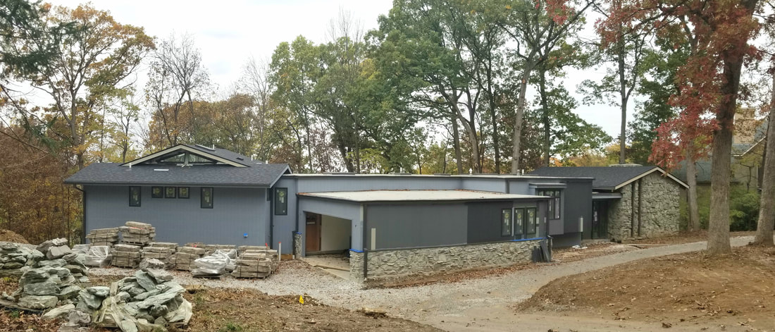
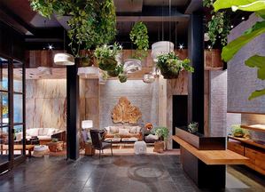
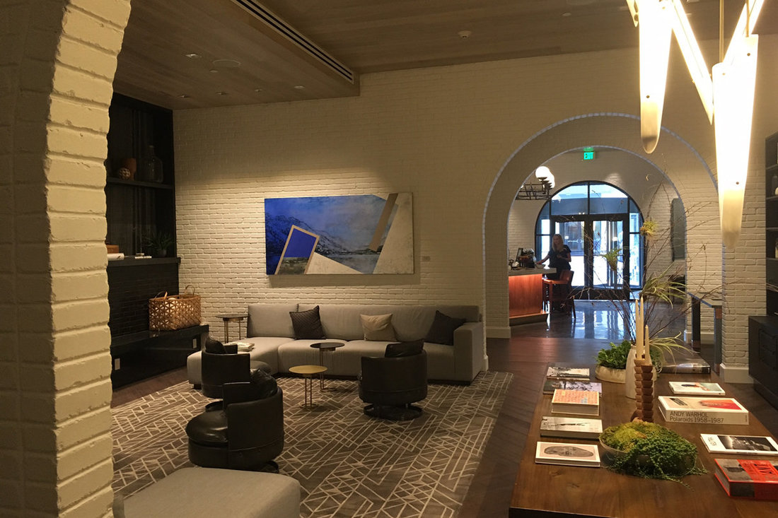
(sound on) DESIGN SPEAK ▶️ For every design element in a built environment there is an intended reaction. Enter the tenants of environmental psychology and hospitality design. Enter the Angad Arts Hotel in St. Louis. AAH's facade, entrance, and reception gallery poke at your ability to be curious. The initial space pulls you into its world and away from yours. You are encouraged to experience life in a different way. Once inside the vestibule you will explore the wall art, sit upon the communal chair bench, open doors of intrigue, and think about finding the reception desk. The atypical wayfinding strategy forces you to think differently. You are now primed and ready for a unique hospitality experience that embraces the psychology of color, visual and performance arts, fashion, literature, mixology, and gastronomy. Where's the front desk?
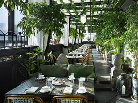
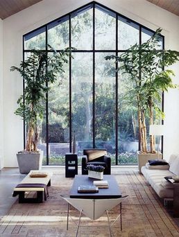
The same tenants used in hospitality design apply to residental design. Recall your favorite hotel. You know the one. It's the one that draws you into the lobby. The one where you could sit in the lobby for hours with a glass of wine and a good book. The special place that just makes you let go of your life outside. That's how you should feel when you walk into your home. You should be feeling that ah ha moment in your own space. This is acheived not by the decorative accessories but the space planning, the color scheme, the lighting plan, and wayfinding strategies. Make your space a place that makes you feel good. @angadartshotel www.angadartshotel.com/ #hospitality #design #gooddesign #environmentalpsychology #curiosity #stlouis #tourist #staycation #angadartshotel #vestibule #grandcenterstl A built environment focused on human-centered spaces requires a specific ambiance as determined by you the client: attitude, emotional response, and spirit of place. Ambiance is a particular feeling associated with a space. Considering the function of the space as a guide, your designer should use design elements that create the desired ambiance: color, texture, light, space, theme, and location. “Colors are the catalyst for feelings, molding moods, and enhancing our lives” (Eiseman) and their psychological effects require consideration. In creating a home-like mood hotels, restaurants, and hospitals are selecting organic tonalities and textures, with wood and stone, and adding fireplaces and water features (IIDA). Reproducing natural landscapes with natural daylight creates a calming familiarity. Biolyphic design tenants play an important role in creating the mood, the ambiance, and the "feel" of any space. Commercial spaces are replicating the outdoors and the cozy "at home" ambiance so you stay longer, spend more money, and return more often. Hospitals seek a comfort level that reduces your stress level and speeds your recovery. Do our homes actually reflect these design elements? They should.
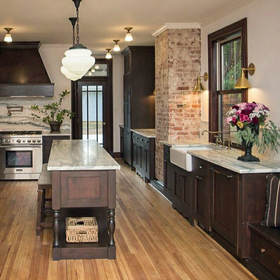 As a designer who cares about design education, experience, and eagerness to learn how to do things right I follow carefully internet images from all sources, professional and amateur, from all over the world. I put a keen eye on the lighting plan on each interior design image. There are people who scream at the football game on television. There are those that scream at the political discourse on cable news. And there is the one who screams at online interior design images because, though the overall design plan might be award winning, the lighting plan is non-existent. Too many designers + architects are not paying attention to the clients' intended use of space and the function required of light sources in that space. Lighting fixtures must be more than pretty. They must perform. I preach daily "color is the first thing the eye perceives" and folks, you cannot see color without proper lighting. This is most worthy of repeating, "You cannot see color without proper lighting." On my Instagram account @twowithcolor I carefully digest images discussing color, design elements, and lighting. I dissect the elements so that the viewer can learn why the image works or doesn't work. I avoid generic flattery, the word "perfect", and remarks lacking any point at all. My niche is educating those who want to know more about what they don't know. Today I posted the image of the kitchen seen in this blog post with the topic lighting speak. I state clearly the important elements that makes this a grand example of a successful kitchen lighting plan....layered lighting, proper uniform Kelvin temperature (30K), good distribution, effective lumen output, distinguished fixture styling enhancing the1897 historic renovation, finally...a well executed lighting plan, fabulous work by Chelsea @chelseadesigncompany, with lighting assistance by Geri @wilsonlightingclayton. Chelsea's overall kitchen design is truly award worthy. She honored the home's 1897 roots wanting to update the lifestyle of the space without making it too current. Small custom-built flush mounts replaced today's standard recessed cans. Solid brass wall scones replaced typical under cabinet lighting. And, the island lighting is simply old school - white opal etched glass eliminating the glare found in the bare-bulb lantern so popular in 2017. The future owner of this kitchen will be impressed by the quality, quantity, and distribution of light in this room. Well lit rooms feel good, look good, and play a big part in selling a home! This home, located in Webster Groves, MO, will go on the market later next week. Finally, a special thanks to Chelsea for sharing this historic renovation. I respect a designer eager to learn how to execute a good lighting plan. (photo by Emily Rose Studios) 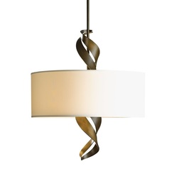 I had a really great design experience recently that just needs to be shared. Why was it great? Because the client gave me a new adjective for describing objects, a new style. It's perfect. The story. A client decided to replace the light fixture over their breakfast room table. They are Mandy and David. Mandy explained that they have been searching, buying, and returning light fixtures for six months without any success. David shared that they were either too big, too small, too tall, too short, too much, too little, or just not enough. "Enough?", I asked inquisitively. Mandy replied, "They were all so boring. I want a bipolar light fixture." David looked at me with a less than a blank face. I responded to Mandy in an all exuberant voice, "Bipolar! I get it. You want a fixture that is calm on days you're not in the mood for anything more than camomile tea BUT can be provocative on those days when you're feeling wild and adventurous. I GET IT. Bipolar." David, still looking my way, changed his expression to amazement and blurted out, "You know what the hell she's talking about?" Yes, I do. It's perfect, bipolar design. Mandy laughed in relief to find someone who spoke her language. I speak many design languages. I decided at that moment that a new style category was born. The conversation continued with me comparing and contrasting bipolar design versus transitional design. I continue. Transitional design falls into the category 'all for one, one for all'. It's the design style that is neither here, nor there. It is chosen when one can't make a decision, needs a compromise to the Mars-Venus conflict, or staging a house for resale seeking not to offend anybody walking through the door with checkbook in hand. Transitional, as I told Mandy, is just a cup of camomile tea. It offers straight lines, curved profiles, with no fuss. It's purpose is to marry traditional and contemporary. It removes the classic details found in traditional European designs leaving behind stripped down frames that can easily be proportioned to today's larger more casual rooms. With bipolar design now the style of the day I knew exactly where to go to find the perfect light fixture for Mandy and David. Once we determined ceiling height, table size, surrounding light sources, finish color, and lumen output requirements we began the search for the perfectly sized bipolar fixture. Bypassing the run of the mill vendors I went straight to the king of artisan design - Hubbardton Forge. Hubbardton Forge is based in Vermont and is one of the country’s oldest and largest commercial forges operating today. Its designers have big ideas, possess a passion for design, and respects high-quality craftsmanship. The HF artisans handcraft each product, one at a time, right here in the good old USA. And, as a ReGreen trained designer I value the many benefits this fact offers. Within in minutes of flipping the pages of the HF catalog we found the perfect bipolar fixture for Mandy and David. They fell in love with the Folio drum shade pendant and its extruding ribbons of hand-forged steel. It is the captivating visual element of the steel ribbons (the adventurous personality) emerging from the simple drum shade (the camomile personality) that gives us the opportunity to interpret our mood for the moment. The Folio is bipolar! As each Folio is made to order Mandy selected the burnished steel finish for the ribbons and the Anna natural shade. In six weeks Mandy and David will have more than a perfect fixture. They will have a stunning work of art that happens to be a light source with a split personality. Final note. Below are two light fixtures that are all or nothing. They offer a single personality. On the left, a very stylized busy piece that is always begging for constant attention, expecting you to drop everything and look at all its details: color contrast, straight lines, curved lines, drum shade, candle arms, candle holders, iron metal finish, crystal columns, crystal tear drops - woo I'm pooped. Manic! On the right, an over simplified drum shade that doesn't expect any kind of attention. Walk in the room and it's just not there. It is the shy, introverted wall flower that doesn't want to be talked to at all. Sure it goes with everything because it offers nothing. That's why it's transitional. I call it depressing. 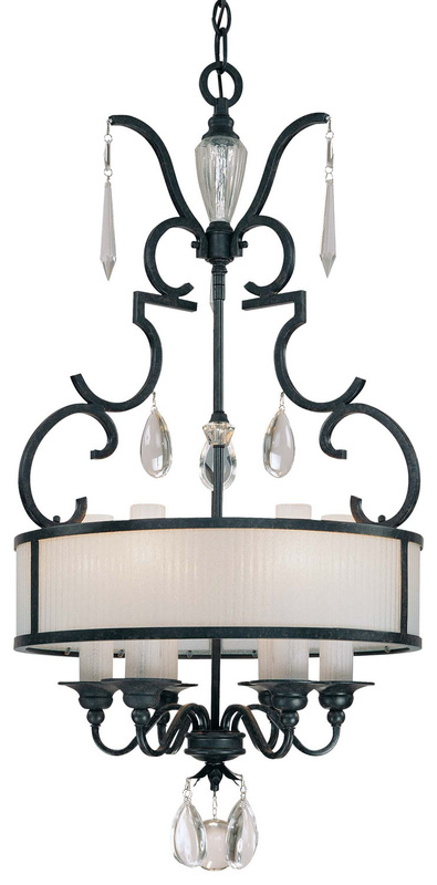 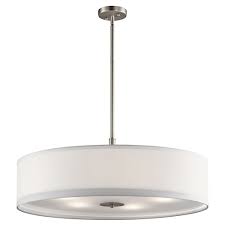  "Let's start at the very beginning - a very good place to start."
Hear the melody? Words sing to you. And, so do colors. A-B-C, Do-Re-Mi, Red-Green-Blue! Color is the very beginning of a well laid design plan. The first thing your eye perceives is color. Shapes, forms, light/dark contrast will fill a room but your eye will always recognize the color in a room before anything else. Color is THE room and as such you should understand your personal color sensory before starting an interior design project. Color sensory is your personal response to specific color. There are millions of pigments the eye can recognize and no two people process color and react to it in the same way. This process is a biological, psychological, and an emotional experience. Our color preferences are based on these elements. We are all wired differently when it comes to color acuity. How well we see color is determined by the retina, the color cones perceiving the color, and the brain's ability to process the image. We obtain our color preferences at a young age from happy, sad, or traumatic times - color memories that you share with no one. Learn the reason behind your color preferences and your fear of using color will vanish. Simply put, color preference is not random and certainly not a trend. When choosing a color palette for our rooms it is important to note that we should not judge a single color by its lonesome. We understand a single color best by how it relates to other colors in our line of sight. We create a melody by viewing a range of hues allowing them to vibrate one off the other. You will sense when you have found the perfect palette. It will sing to you. Its melody will play to your mind, body, and soul. Color is a very good place to start. It is the beginning. Know and trust your unique color sensory. Choose the palette that sings to you. Let go of your friend's response to your chosen palette. It's yours and yours alone. Own it!  Flash comment.
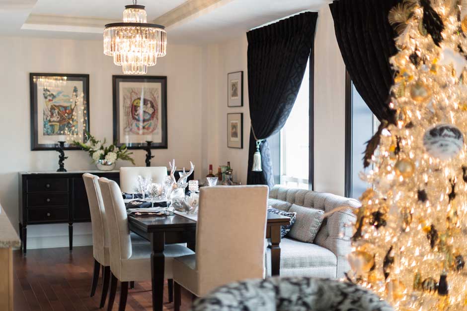
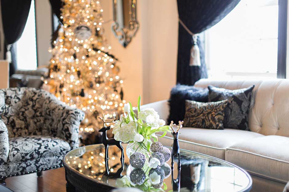
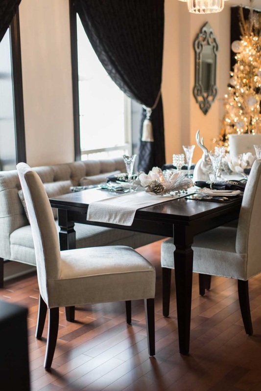
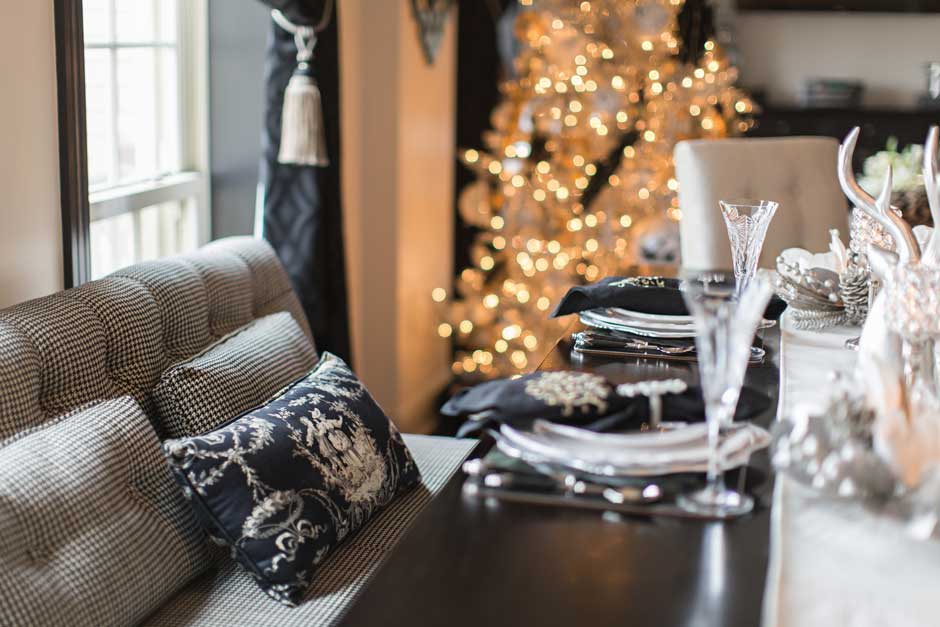
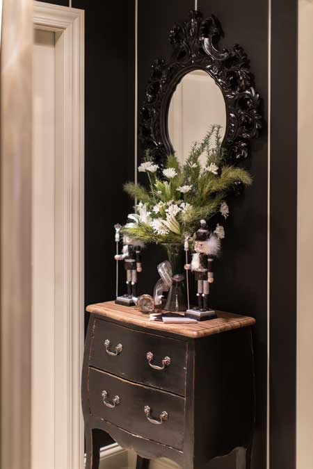
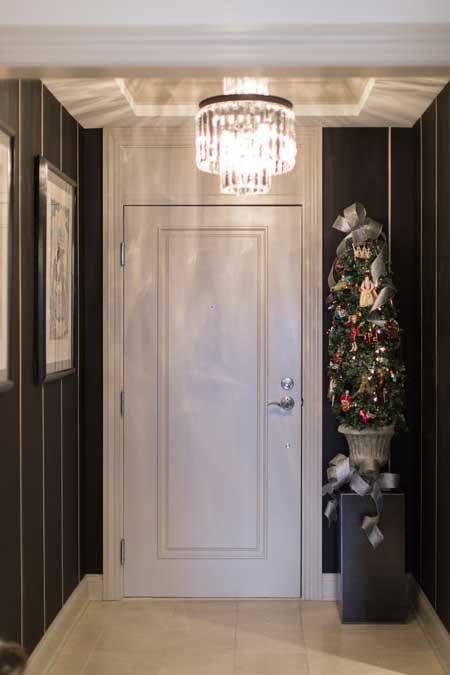
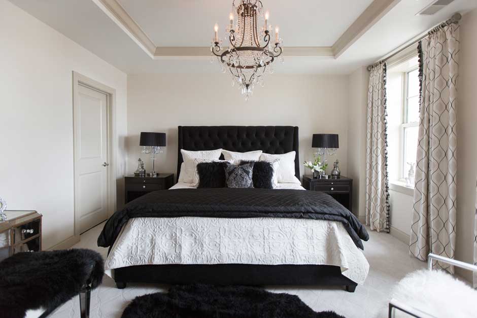
We obtain our color preferences at a young age from happy, sad, or traumatic times - color memories. Lilac stirs memories of your grandmother's bedroom where she read you her favorite story. Red recalls your favorite peppermint candy. Orange flashes back to the time your were frightened by the zoo tiger roaring so load. Sage is a sore subject as it was worn frequently by your high school English teacher that you hated. What is the color that you cannot make yourself like? What past association comes to mind? The answer may take some time and could probably pop up when you're not thinking about it. Associations do that. Know the reason behind the preferences of those you live with. It will save a lot of arguing. We also respond to colors via styles and trends of the season. Happy times yields happy colors. Times of struggle reflect muddied colors and extreme neutrals. Warm hues are popular in summer, cool in winter. (Maybe that should be switched. Let's cool off with blues on a hot summer day. Warm up in winter with sunny yellows and oranges.) Where we grow up affects our color preferences. Local culture, topography, and ethnic traditions influences how we use color on a daily basis. Coastal residents favor blue families where as mountain folk favor greens. Holidays reveal colors seen in the festivals both small and large. We are all wired differently when it comes to color acuity. How well we see color is determined by the retina, the color cones perceiving the color, and the brain's ability to process the image. This is reason not to criticize one who describes a color differently than you. Trust your own color acuity. Only you see color the way you do. Throw caution when you ask for another opinion. 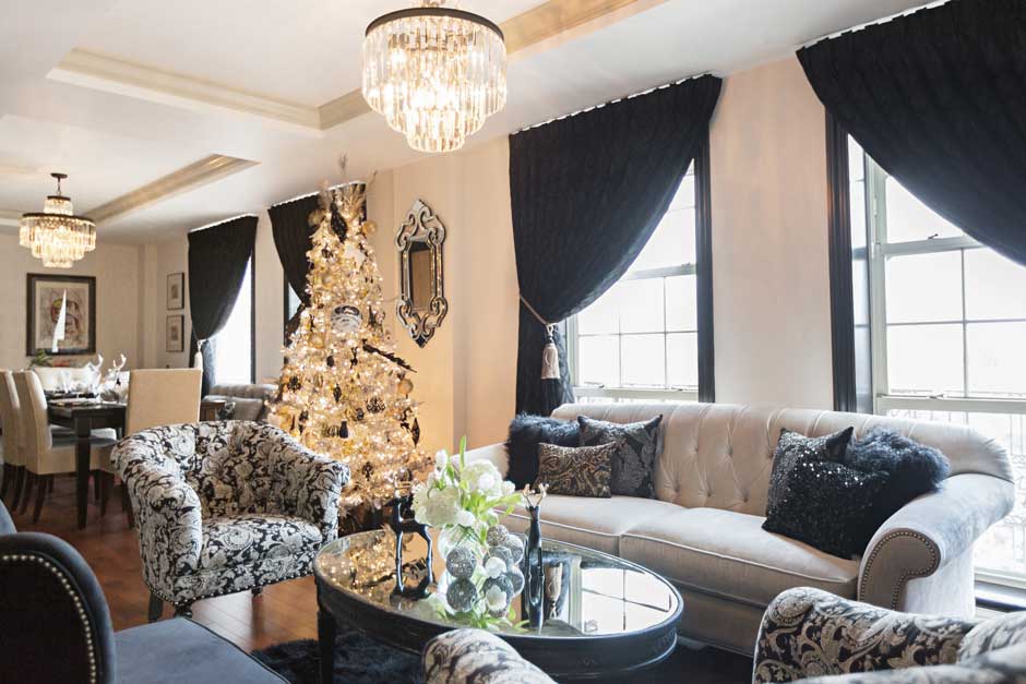 I have said over and over that color is nothing to be scared about. And, lack of color is nothing to be scared about either. Lack of color can yield an aesthetically gorgeous space with consideration to color theory and elements/principles of design. Lack of color is simply a palette that is full of neutrals: grey, black, white and neutral colors. Neutral colors can include the tan, beige, taupe families, variations of brown, and an array of other slightly tinted hues that read "quiet". The lower the light reflective value and the lower the saturation level, the more neutral a color can be. Never forget that the first thing the eye perceives is color and secondly, the contrast of light and dark. If there is no color then contrast must step up to the easel and control the canvas IF you seek a mid-high energy space. Black and white is a versatile palette. It's the palette that is a friendly companion to a wide array of period designs, styles, and furnishings. There are the obvious: Art Deco, Modern, Contemporary, and Hollywood Regency. Don't be afraid to specify the black and white palette in your stylings. Black and white can work the casual room, the formal room, and anywhere in between. It works with everything, is not boring, IF you work the contrast strategy! Located in the historic Chase Park Plaza complex this condominium is black and white through and through. This space has great architectural bones, generous amounts of natural light, and fabulous views of downtown and the St. Louis Arch. Who needs to see color when you have all this to excite your senses? My client was eager to rid her life of the old drab shabby stylings found in her single family home and took a leap towards glam, fab, and lux in this 15th floor mid-town condo. She wanted black and white. She wanted pattern and textures. And she wanted to love it all. I listened to her words, monitored her pulse, and through the professional design process we created her perfect home. There were no random acts of design in this space! Note: my client also wanted to keep the same energy in the space during the holiday season and choose, wisely I must say, to keep her seasonal decor in the neutral palette as well. For product specifications and photographer credit please email via contact form. click on image to enlarge |
AuthorGeri loves to consume color through art, architecture, photography, and interior spaces of all built environments. She is a museum enthusiast. Exploring new places, cultures, and restaurants will always be a part of her life. Geri loves the creative process of cooking with natural fresh local ingredients and adores the beauty of colorfully plated food. 
Archives
July 2021
|


 RSS Feed