 Color-Blind Artist Neil Harbisson Uses Webcam-Like Eyeborg to ‘Hear’ Color
There is the art of color and then there is the science of color. Gerry Hadden from PRI's The World submitted this story about a 28 year-old born without the privilege of seeing color. Neil Harbisson did not let his fascination with the absence of color in his life stop him from understanding the science of color. Read, see and listen to his story. This reminds me that seeing color is indeed a privilege and highlights just how significant the power of color is - even for those who don't see it. photo: by Gerry Hadden
0 Comments
Leatrice Eiseman  January 2012 was a month full of colorful education. I attended the Eiseman Center for Color Information and Training program staged in beautiful downtown Burbank, California. In an effort to further advance my knowledge in the art and science of color I sought out the leading color expert, Leatrice Eiseman – Executive Director of Pantone Color Institute, a member of ASID and IDSA, chair holder of the Color Marketing Group, and the list goes on. Her color selections for various industries have won numerous awards including an award from Industrial Design Magazine for the newest group of colorful Leatherman Utility Tools called “Juice” and Schick Women's "Intuition" Shaver. (see images below) She has authored five color books, has been quoted in numerous international publications, and has appeared on TV and radio talk shows throughout the world. Leatrice advises color marketing groups for many national and international companies. She selects Pantone's color of the year (2012 Tangerine Tango) and names the top ten fashion colors twice a year for Women's Wear Daily – and now men’s colors too. Eiseman is the go to colorist for understanding color and its influential power. I am so excited and honored to have worked with Leatrice Eiseman – I am learning from the best. In Burbank I explored professional color systems, retail color management, product color specifications, the emotional power of color influencing, attended workshops on color combinations, discussed advanced color techniques including color naming and specifying, and learned the how-to's of color forecasting from Eiseman and was able to walk away from this intense color training with a fortified foundation of color knowledge that can be applied to ALL built environments. Having studied the psychology of color in my undergraduate program, writing my thesis on the topic, I learned early on that a successful designer and merchandiser must have a strong understanding of color: art, science, and psychology. With this strong foundation, years of practical experience, and a skilled eye I received credible and veritable information based on the emotional aspect of color. In the coming weeks I will be adding writings to this blog on the topics discussed in my advanced Color/Design training. I will be happy to share my knowledge with you and give you a COLOR TASK. Check back to see what you can learn. EMOTIONAL RESPONSE TO COLOR During the training I was given the latest information on the emotional messages and meanings of each color family. As humans we respond on a subconscious level to color - most of the time. (see appetite response in Power of Color blog below dated 02.08.12) Our psychological responses to colors range from a state of tranquility to that of agitation, in varying degrees and are usually developed in childhood. As children we develop attachments to color based on three diverse influences: sad, happy, or trauma. It is quite typical that if we love a particular color it has a happy association from childhood. If we hate a particular color there is certainly a deep negative often traumatic attachment to it. Is there a color that agitates you? What is your negative association to that color? Me? I love all color, or so I thought. While taking the color word association quiz in class I struggled to respond negatively to any of the 38 colors listed however when I pushed myself I finally marked a negative response to the color burgundy. My word association to burgundy was stubborn. Eiseman was puzzled by my response. As the other class participants discussed their quiz results I just could not make an emotional connection to mine. Eiseman stated, "the recognition of the negative association may take a long time to surface." My association surfaced in class while another colorist was discussing hers. Bingo! Of course, it was high school. While attending a parochial school I was required to wear a uniform. Can you guess what color uniform? Yes, it was burgundy, a herringbone woven skirt with two inverted box pleats in front and back, worn with a burgundy cardigan sweater, and burgundy knee socks. The stubborn association stems from the social and structural environment of a private high school of those days - strict religious influence accompanied with a heavy dose of gender inequality - I was not allowed to take a mechanical drawing class because I was not a boy. My attempts to convince the administration that this gender rule was unfair and unethical proved to be a waste of time - they were simply stubborn. Disturbing then and now! To this day I believe that if I had taken the mechanical drawing class I just might be designing bridges and buildings today. I prevailed however in another field harnessing my creative spirit in the interior design of built environments using the tenants of environmental and color psychology – elements well beyond the simplistic surface embellishments we often use to “decorate” our spaces. Understanding the disconnect that I have had with the color burgundy I will now be able to specify its use in my personal space should it be the perfect hue to complete a well designed color palette. I don't have to avoid it or be afraid of it any more. Yes! The reason for understanding your negative association with a particular color is important. First, recognize it, acknowledge it, and realize that it is not the color that agitates you but the association that you have with it. So, when your friend loves the color that you hate please please do not voice your opinion when your friend is choosing the color for their own space. Perhaps your friend has an incredibly fond happy memory attached to a favorite grandmother and enjoys the comfort of living with that color. Color preference is personal simply due to our emotional attachments to them and not so much to the popular color trends of the day. Know that your emotional attachments are important, unique and should NOT be influential in a space that you do not live or work in. COLOR TASK: Sit for a quiet moment in one of your home or work spaces, decide if you like being in the space. Then determine if it is a particular color that you see that does not resonate with your own emotional attachments: happy, sad, or traumatic. Forget about the color trends, forget about HGTV, forget about "the decorator", forget about your mother, sister, and friend. This is about YOU and YOUR attachment, not theirs. Of course those actually living in your space should weigh into the color specifications - especially if it is their own personal space within. If the color in your room is not right, well then, you need a colorist - call me, we'll talk. Share your unique color preference or lack of and its attachment in "add comment" below.   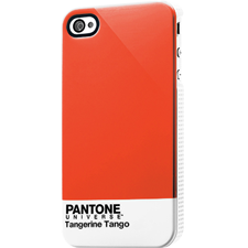 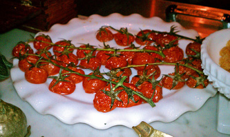 Red, red, red. Red is out there. Red tugs and pulls on our senses and psyche. In pure form it is bold and physical. It gives us life. It makes our heart pump. It releases adrenaline. It represents life sustaining blood. It arouses our appetite. It arouses our sensual side. So why are we so afraid of red? Why do so many of us see red paired with green and just think Christmas? Spending a lovely evening at Osteria Mozza in Los Angeles was an experience never to be forgotten. I sat at the Mozzarella Bar viewing the culinary creations of Mario Batali and his partners come to life while I savored my dinner. (see below for my dining selections.) The u-shaped counter top was lined with colorful ingredients used in the recipes from the mozzarella menu: whisper whites gleamed from the three mozzarellas, bronze spiced walnuts, banana creamed colored pine nuts, deep cactus colored fried rosemary, a green rainbow of olives, raspberry colored currants, bacon reflecting tones of brown sugar and apple cinnamon, honey and amber gold tones glimmered from the fresh honey-comb, clean ecru tones softened the Parmigiano Reggiano, with zesty green mint pesto, just to name a few. In front of me sat this gorgeous plate of roasted cherry tomatoes on the vine. The natural bright reds of these succulent tomatoes were so appetizing. Clinging to the vine the red of the fleshy tomato was complimented by the green of the vine. Each making the other more brilliant. (That's what complimentary colors do.) I was not reminded of Christmas. I saw veggies loaded with healthy antioxidants. Oh so appetizing! Hey, it is time to stop the Christmas association with red and green. Unprocessed red foods are healthy and green adds a restful restorative component to our psyche - why we love going to the park. It is time to see red and green for what they are - colors found in nature that can bring a healthy approach to our built environments. Can't handle the boldness of pure red? Then bring it down with a bit of brown and/or blue creating paprika, cranberry, baked apple, or tandori spice. All delicious and easy to live with. Grab some red and feel your senses come to life. Where is the red in your life? Living Color in food! Baby Kale with pine nuts, ricotta salata & marinated anchovies Burrata with bacon marinated escarole & caramelized shallots Tagliatelle with oxtail ragu Wine selection Morellino di Scansano La Mozza "I Perazzi" - Toscana | 200 http://www.osteriamozza.com/LA/home.cfm photos: private collection gfhayes  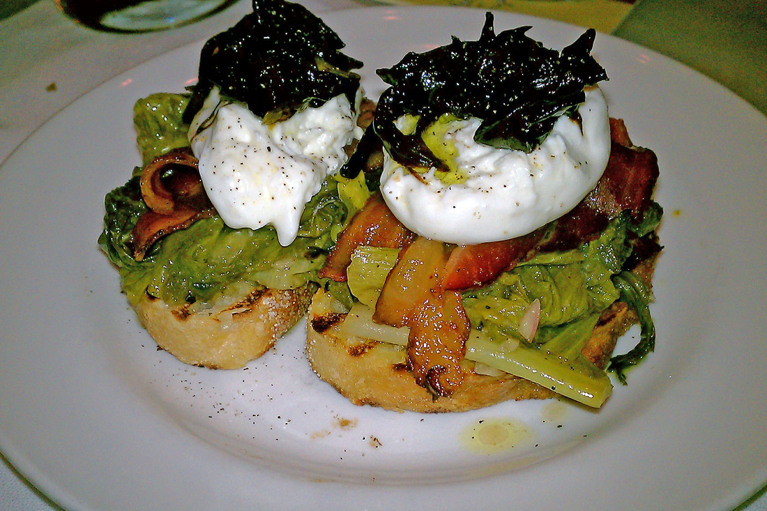  |
AuthorGeri loves to consume color through art, architecture, photography, and interior spaces of all built environments. She is a museum enthusiast. Exploring new places, cultures, and restaurants will always be a part of her life. Geri loves the creative process of cooking with natural fresh local ingredients and adores the beauty of colorfully plated food. 
Archives
July 2021
|
 RSS Feed