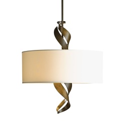
 I had a really great design experience recently that just needs to be shared. Why was it great? Because the client gave me a new adjective for describing objects, a new style. It's perfect. The story. A client decided to replace the light fixture over their breakfast room table. They are Mandy and David. Mandy explained that they have been searching, buying, and returning light fixtures for six months without any success. David shared that they were either too big, too small, too tall, too short, too much, too little, or just not enough. "Enough?", I asked inquisitively. Mandy replied, "They were all so boring. I want a bipolar light fixture." David looked at me with a less than a blank face. I responded to Mandy in an all exuberant voice, "Bipolar! I get it. You want a fixture that is calm on days you're not in the mood for anything more than camomile tea BUT can be provocative on those days when you're feeling wild and adventurous. I GET IT. Bipolar." David, still looking my way, changed his expression to amazement and blurted out, "You know what the hell she's talking about?" Yes, I do. It's perfect, bipolar design. Mandy laughed in relief to find someone who spoke her language. I speak many design languages. I decided at that moment that a new style category was born. The conversation continued with me comparing and contrasting bipolar design versus transitional design. I continue. Transitional design falls into the category 'all for one, one for all'. It's the design style that is neither here, nor there. It is chosen when one can't make a decision, needs a compromise to the Mars-Venus conflict, or staging a house for resale seeking not to offend anybody walking through the door with checkbook in hand. Transitional, as I told Mandy, is just a cup of camomile tea. It offers straight lines, curved profiles, with no fuss. It's purpose is to marry traditional and contemporary. It removes the classic details found in traditional European designs leaving behind stripped down frames that can easily be proportioned to today's larger more casual rooms. With bipolar design now the style of the day I knew exactly where to go to find the perfect light fixture for Mandy and David. Once we determined ceiling height, table size, surrounding light sources, finish color, and lumen output requirements we began the search for the perfectly sized bipolar fixture. Bypassing the run of the mill vendors I went straight to the king of artisan design - Hubbardton Forge. Hubbardton Forge is based in Vermont and is one of the country’s oldest and largest commercial forges operating today. Its designers have big ideas, possess a passion for design, and respects high-quality craftsmanship. The HF artisans handcraft each product, one at a time, right here in the good old USA. And, as a ReGreen trained designer I value the many benefits this fact offers. Within in minutes of flipping the pages of the HF catalog we found the perfect bipolar fixture for Mandy and David. They fell in love with the Folio drum shade pendant and its extruding ribbons of hand-forged steel. It is the captivating visual element of the steel ribbons (the adventurous personality) emerging from the simple drum shade (the camomile personality) that gives us the opportunity to interpret our mood for the moment. The Folio is bipolar! As each Folio is made to order Mandy selected the burnished steel finish for the ribbons and the Anna natural shade. In six weeks Mandy and David will have more than a perfect fixture. They will have a stunning work of art that happens to be a light source with a split personality. Final note. Below are two light fixtures that are all or nothing. They offer a single personality. On the left, a very stylized busy piece that is always begging for constant attention, expecting you to drop everything and look at all its details: color contrast, straight lines, curved lines, drum shade, candle arms, candle holders, iron metal finish, crystal columns, crystal tear drops - woo I'm pooped. Manic! On the right, an over simplified drum shade that doesn't expect any kind of attention. Walk in the room and it's just not there. It is the shy, introverted wall flower that doesn't want to be talked to at all. Sure it goes with everything because it offers nothing. That's why it's transitional. I call it depressing. 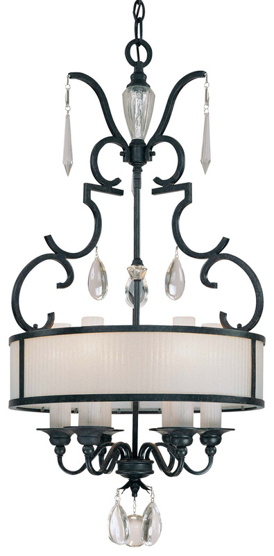 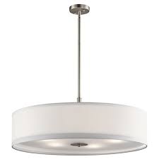
0 Comments
 "Let's start at the very beginning - a very good place to start."
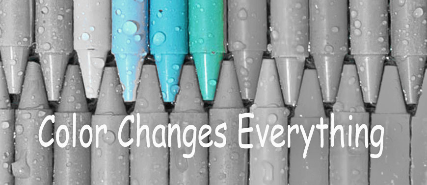
Hear the melody? Words sing to you. And, so do colors. A-B-C, Do-Re-Mi, Red-Green-Blue! Color is the very beginning of a well laid design plan. The first thing your eye perceives is color. Shapes, forms, light/dark contrast will fill a room but your eye will always recognize the color in a room before anything else. Color is THE room and as such you should understand your personal color sensory before starting an interior design project. Color sensory is your personal response to specific color. There are millions of pigments the eye can recognize and no two people process color and react to it in the same way. This process is a biological, psychological, and an emotional experience. Our color preferences are based on these elements. We are all wired differently when it comes to color acuity. How well we see color is determined by the retina, the color cones perceiving the color, and the brain's ability to process the image. We obtain our color preferences at a young age from happy, sad, or traumatic times - color memories that you share with no one. Learn the reason behind your color preferences and your fear of using color will vanish. Simply put, color preference is not random and certainly not a trend. When choosing a color palette for our rooms it is important to note that we should not judge a single color by its lonesome. We understand a single color best by how it relates to other colors in our line of sight. We create a melody by viewing a range of hues allowing them to vibrate one off the other. You will sense when you have found the perfect palette. It will sing to you. Its melody will play to your mind, body, and soul. Color is a very good place to start. It is the beginning. Know and trust your unique color sensory. Choose the palette that sings to you. Let go of your friend's response to your chosen palette. It's yours and yours alone. Own it! |
AuthorGeri loves to consume color through art, architecture, photography, and interior spaces of all built environments. She is a museum enthusiast. Exploring new places, cultures, and restaurants will always be a part of her life. Geri loves the creative process of cooking with natural fresh local ingredients and adores the beauty of colorfully plated food. 
Archives
July 2021
|
 RSS Feed