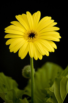
 Several times this week I have been asked what is my personal favorite color. Good question since I do boast that I do not design a client's space built around my personal preferences. The color that tickles my fancy the most is yellow. "Yellow", you say. Doesn't yellow make adults argue and babies cry? Absolutely not! Repeat, absolutely not. Leatrice Eiseman shared her research in which she busted the urban legend about yellow at the advanced Color & Design seminar that she instructed and I attended. (See blog posting below dated 02.20.2012) "After hearing that [yellow] story once too often, I tracked its source and discovered it was based on false research," Eiseman stated. "Yellow evokes sunshine, warmth, and happiness - not arguments and crying." Retrieving personal color preferences from childhood I have yet to identify any one specific event, location, or attachment I have to yellow. It will come to me one day - when I'm not trying, of course. I do know that I love how yellow makes me feel. My all time favorite yellow thing is the yellow daisy. Yellow daisies have been represented at many important moments and events in my life. Holding on to the center each petal is unique and points in a different direction - with a mission in mind I'm sure. Despite their individuality and position each petal works harmoniously in totality. I love the form and the color - it is a little bit of sunshine. Humans react to and make connections to all colors. Yellow sparkles, is connected to the sun in a way that evokes energy and vitality. A color that represents curiosity yellow enlightens intellectual energy and stimulates the imagination. Never dark or dim yellow is extroverted. Attracted to an infant's eye yellow is important in human development into the toddler years. Yellow light waves stimulate the brain, clears the mind, and encourages decisive action - the reason life feels better on a sunny day. Yellow is the most visible of all colors because it has the highest reflective value. Yellow is often used to draw attention and could be the reason why some people do not like yellow - in its brightest form yellow is not calm and is not introverted. Yellow represents originality and resourcefulness of an open mind. It is joyful, hopeful, and carries an air of optimism. Yellow grabs our attention and is often used in signage, packaging, and points of purchase. Yellow is found in our favorite comfort foods in mellow yellow shades: mac & cheese, french fries, and chardonnay. Soft golds are pleasant and relaxing - and pairs nicely with ocean blues. And least we forget, yellow shines in metallic gold hues reflecting sophistication, wealth, and luxury. Add a metallic shimmer and the gold tone blankets the room in warmth. See Benjamin Moore's Hollywood Gold #279. http://www.benjaminmoore.com/en-us/for-your-home/color-gallery?cd=279&col=CC#ce_s=holly What's not to like? Do you have some form yellow in your life? COLOR TASK: With spring time blooming find yourself a FRESH bouquet of flowers - daisies if you choose. Without making a fuss place the flowers loosely in a vase allowing the stems to roll off the top. Keep it casual and unstructured. Let the color speak to you. Set the vase in your kitchen window or your bathroom counter top - a space that you frequent and would not normally place fresh flowers except when you entertain. Make note of your internal reaction each time you walk into the room. Take a calm breath, sniff the fragrance, and enjoy your day.
0 Comments
|
Details
AuthorGeri loves to consume color through art, architecture, photography, and interior spaces of all built environments. She is a museum enthusiast. Exploring new places, cultures, and restaurants will always be a part of her life. Geri loves the creative process of cooking with natural fresh local ingredients and adores the beauty of colorfully plated food. Archives
July 2021
|

 RSS Feed