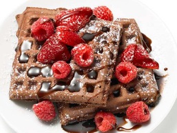
 Brown has become a luscious rich color with the influx of Starbucks over a decade ago. And who doesn't love Godiva Chocolates? Start a special breakfast with chocolate waffles topped with red raspberries and chocolate syrup. Decadent! Though appetizing to some tummies I must ask, "How do we visually process brown and red?" Brown is a neutral color, very earthy, and often holds elements of warmth. Red, being a warm color, complements brown, reflects more light creating an energetic balancing act with brown's calmer state. Nervous about using red in your room? Balance it with lots of brown. The brown & red combo makes an unexpected but so jazzy color statement. Easy on the eye and oh so delicious to eat! Hungry for waffles: http://www.foodnetwork.com/recipes/food-network-kitchens/chocolate-waffles-recipe/index.html BROWN RELAXES THE RED EYE.
2 Comments
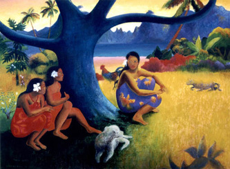
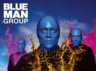
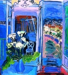
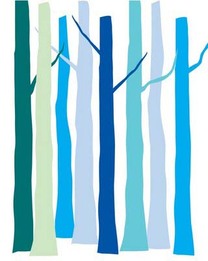 "If you see a tree as blue, then make it blue." Paul Gauguin was well known for his experimental use of color. His strong display of warm colors were often counter-balanced with blue - often out of sync. Placing blue in unexpected forms creates risk and confusion drawing attention that will make a memorable disconnect. Think Blue Man Group! Blue is often portrayed unexpectedly by artist however it is the expected use of blue that more permanently influences our psyche. We are all quite familiar with blue water and blue sky. It is natural. Organic. Easy to live with blue is a favorite color of many. Blue effects us physically. It can be sedating, calming, can ease inflammation, and even lower blood pressure. Blue creates a sense of serenity and respite. It shouts quiet and tranquility. Are we so accustom to sky blue that we are always at ease in its presence? Perhaps it is this organic connection that makes blue such a universal color. It is after all a gender neutral color. Yes, there is "baby boy blue" but all the other blue hues are indeed gender neutral. There are many many associations with the color blue. It represents the highest order of justice, moral behavior, and devotion. The blue ribbon suggests the best in quality, skill and achievement. It is the most used color in corporate logos, identification, and branding. Though blue can suggest a puritan affect it is interestingly considered indecent: blue movie, blue laws, blue devils, blue moods, depressed, and even melancholy. Blues can influence our spaces in many ways. Light to mid-tone blues are open and expansive as the sky. They are optimistic, eternal, enduring, and of course, calming. Darker blues are far more serious, can draw you inward, create a retreat, and encourage creativity. The deeper grayed blues sense turbulence showing a bit of moodiness that can be unsettling - moody blues. Gleaming, shiny, and brilliant are the electric blues that defy the typical "cool" message. The hottest part of a flame is blue! Electric blues glow in glittering fireworks and shimmer with iridescence in exotic sea life. Periwinkle blues, those with purple influence, are the happiest and warmest of all the blues. Periwinkle is perky, fun loving, and quite nonchalant. When choosing blue in your design pay attention to the "mood" of the blue. Are you seeking a calm, quiet, and peaceful space? Might you want a room with that is exhilarating, full of high spirits and energy? Perhaps you are seeking a space that is more professional, thought provoking, and conservative? Well then, you would choose light blue, bright blue, and deep blue in that order. Blues can create diverse moods. They are not all calming. Choose your blue based on the desired purpose, energy specified, and of course, the size of the room. Certain blues can read neutral in a room - our brain processes various shades of sky blues as a common back drop in our vision - so don't be afraid to add some to your palette. Raoul Dufy, a French Fauvist painter, understood the power of blue. "Blue is the only color which maintains its own character in all its tones...it will always stay blue; whereas yellow is blackened in its shades, and fades away when lightened; red when darkened becomes brown, and diluted with white is no longer red, but another color - pink." Blue is always blue! Therefore it is reliable, constant, and dependable. COLOR TASK: Blue is quite diverse. Have you noticed? Considering your own space make a list of the various colors of blues you've used. Give each a name making a notation if it is light, bright, or deep. Attach to each hue a list of words that describe the mood of the blue. Do these words match your intended aesthetics and function? Might you be making some blue changes? A second task: as you travel throughout your day, on the road to, from and in various locations pay attention to the color blue... the many colors of blue.... and ask yourself, "Does that blue make sense for its purpose?" Paul Gauguin "of course" Raoul Dufy
|
Details
AuthorGeri loves to consume color through art, architecture, photography, and interior spaces of all built environments. She is a museum enthusiast. Exploring new places, cultures, and restaurants will always be a part of her life. Geri loves the creative process of cooking with natural fresh local ingredients and adores the beauty of colorfully plated food. Archives
July 2021
|
 RSS Feed