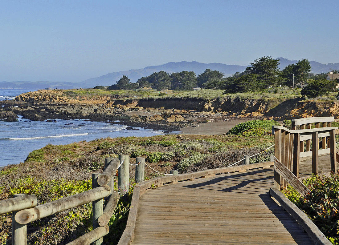
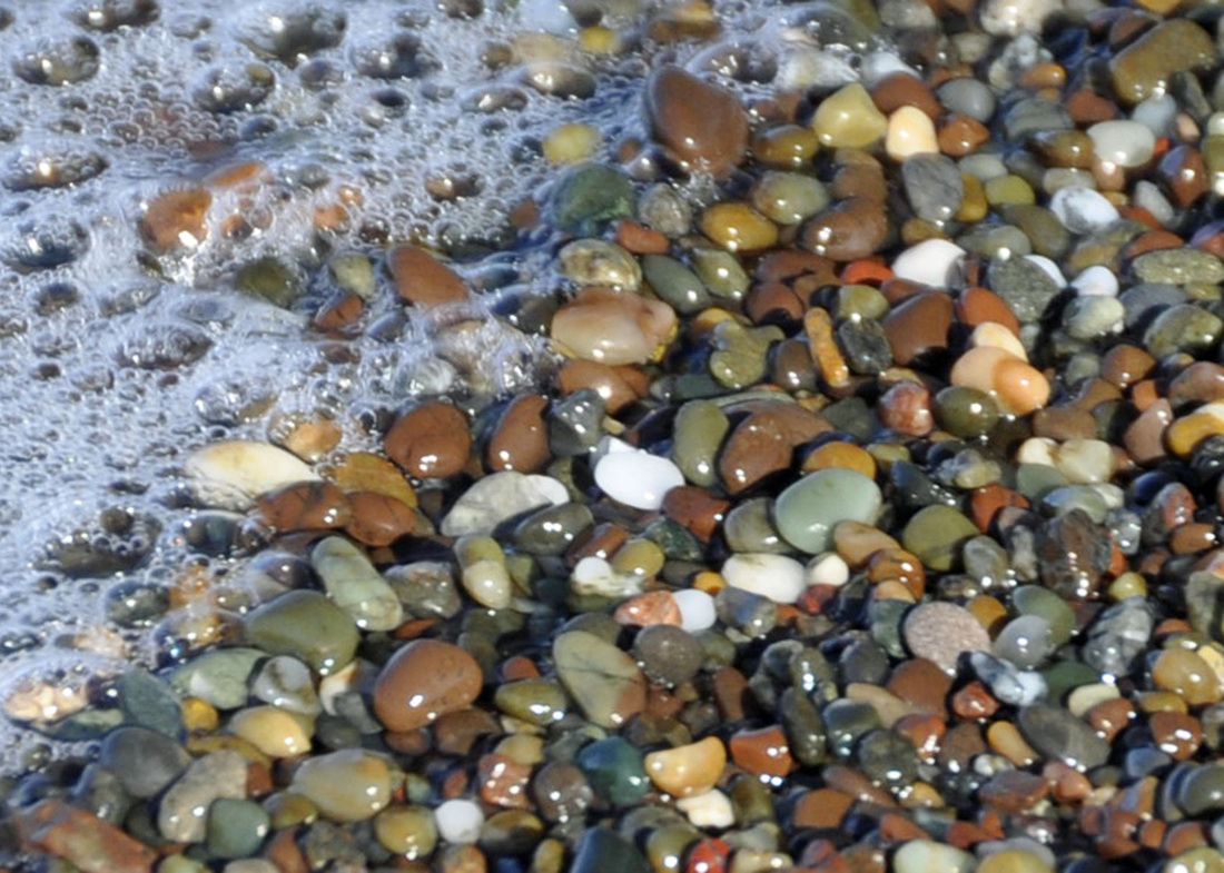
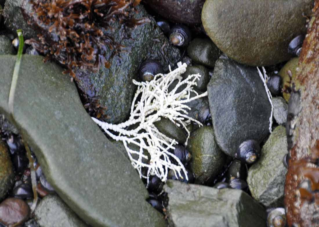
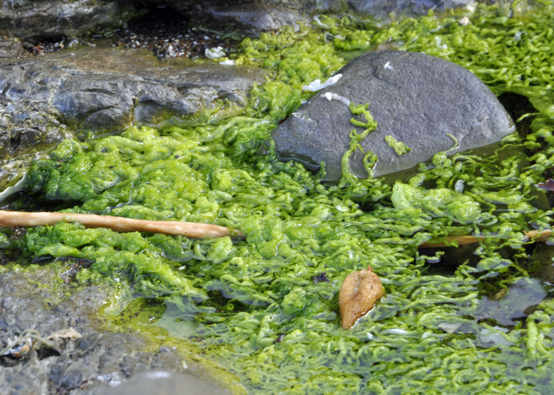
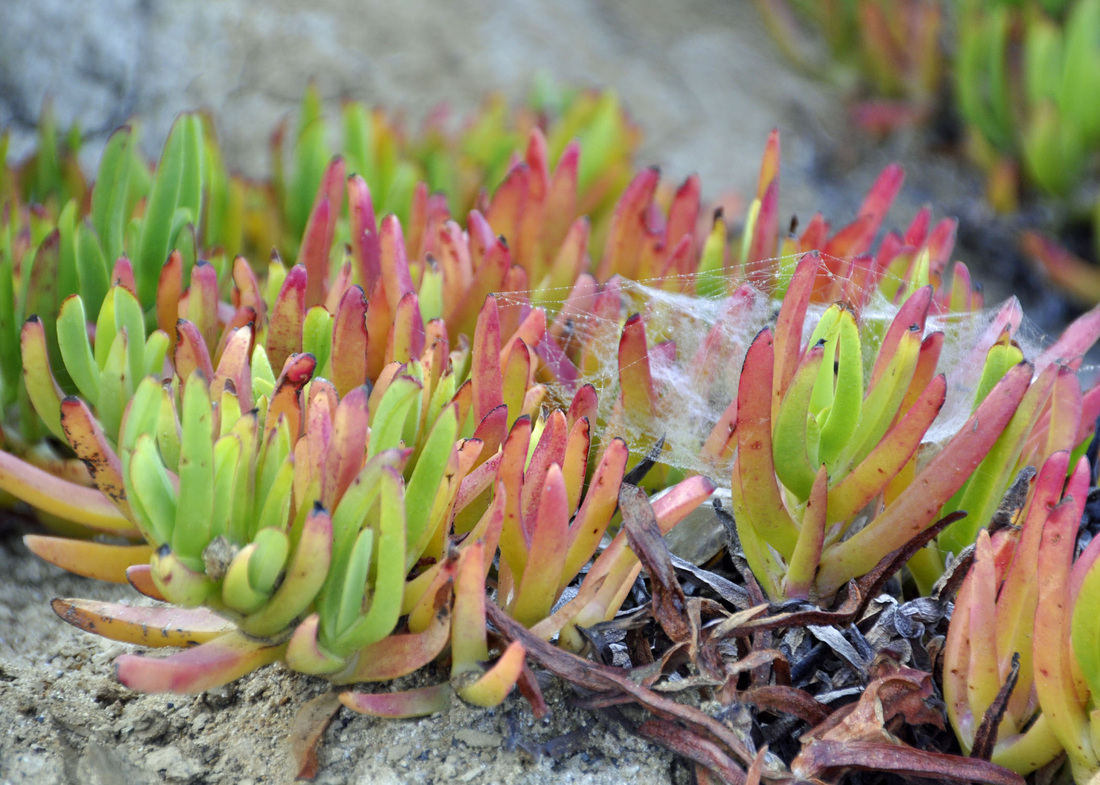
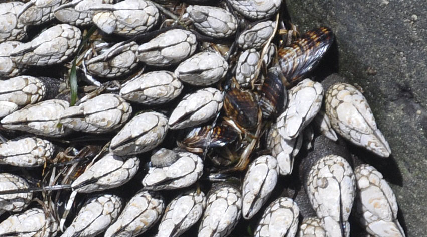
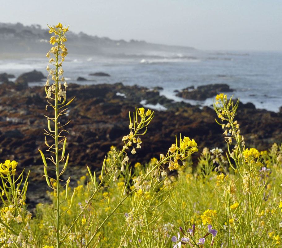
 Moonstone Beach Boardwalk - low tide Moonstone Beach Boardwalk - low tide Really people? Really? You want to sit there and deny your eyes? Admit it. You are afraid of color. You are afraid because you don't think you know how to put color together. Nonsense. You see color every day. Pay attention. Land. Sea. Air. Repeat. Land. Sea. Sky. It's that simple. Interior Design 101 is first about Color 101. Color is emotion. Color soothes the mind, body, and soul. We all react differently to color. Be conscious of your innate reaction and you will be your own personal color stylist. Trust your own eyes and your reaction - not your friend's. Look to nature for your color palette. We are humans. Humans are nature. Color in nature comforts us. Land, sea, Sky. It's there so lets chat. I recently spent time at Moonstone Beach near Cambria, California - a seaside village located midway between San Francisco and Los Angeles. The perfect place to explore land, sea, and sky - morning, noon, and night. The boardwalk easily guides you along the coastline over a mile and a half, offering ample opportunity to step down to the shoreline to explore the tidal pools, observe the Pacific sea otters, and search for moonstones - gems that evoke the moon’s delicate, ethereal light. (Cambria's moonstones are chalcedony, a micro-crystalline version of quartz.) With every boardwalk step I was in color heaven. The camera shutter did not stop clicking for days. Color color everywhere. Beautiful natural color combinations. Nature's inspiration. The first thing the eye perceives is color, second is light/dark contrast, and finally, shape/form. Remember that. What makes an individual color more of less prominent in a space is the light/dark contrast surrounding it. Remember that. Now study the images below. I shot them all while exploring the amazing colors of Moonstone Beach. Simply pay attention. 1. Pay attention to your emotional reaction. 2. Pay attention to the mix of colors - warm to cool, cool to warm. 3. Pay attention to the light & dark areas - light reflective value (LRV) of each hue. It is so important to have highlights and low lights within the same color family. 4. Pay attention to the neutrals: browns, grays, tans, and blacks. It's the neutrals that ground the palette and gives the eye a place to rest. 5. Pay attention: a well designed color palette never gets boring. 6. View each image individually - click on image to enlarge. The Color Marketing Group said it best. "Mother Nature was the first color stylist, with an endless array of color options and a keen understanding of color's purpose in the world. In nature, color isn't random. It attracts, warns, and informs." Remember that. Note: texture, pattern, and scale has been reserved for a different design discussion. Roll cursor over image to see corresponding Sherwin-Williams paint colors. All images property of Geri Hayes - May 2014
1 Comment
|
AuthorGeri loves to consume color through art, architecture, photography, and interior spaces of all built environments. She is a museum enthusiast. Exploring new places, cultures, and restaurants will always be a part of her life. Geri loves the creative process of cooking with natural fresh local ingredients and adores the beauty of colorfully plated food. 
Archives
July 2021
|


 RSS Feed