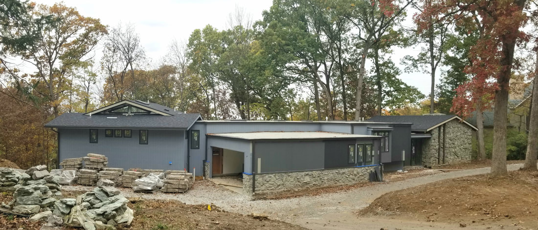
 Discussing color selection for a home's exterior is always significant. This 1967 distorted mid-century home was no exception. The homeowners have taken on the task of general contractor, laborer, designer, and bringing in specialists as needed. Struggling with some key color decisions I was invited to assist in the process. The new floor plan takes advantage of extensive floor to ceiling windows across the back. Stepping into the split-level foyer the feeling is reminiscent of the garage in Ferris Bueller's Day Off. The rear of the house is set high overlooking the pool, the wooded distance, and the expansive sky above. Inside we chatted about interior window and trim stain. We coordinated the existing finishes (stone fireplace, stone wall, walnut accented walls, wood ceiling, wood beams) by selecting a deep hue to frame the massive collection of soaring twenty foot high windows allowing the sight line to move quickly to the outdoors. The wood floor was chosen purely for a biophilic design principle - don't screw with Mother Nature. Laying just outside the floor to ceiling window, adjacent to the enormous stone fireplace, lay the seasonal ground cover, dried leaves in an autumn blonde hue. Done and done. The new wood flooring, repeating the highlights of the stone, would be the same blonde hue running throughout the house acting as the catalyst for everything organic. In the kitchen I was curious about the excessive amount of 6" LED surface mount fixtures on the ceiling - I mean way way too many for the average kitchen. My puzzled face drew a response, "We shoot YouTube cooking videos and need a ton of light". OK that made sense. And, since each light will be individually controlled by a phone app the video chefs created theatrical stage lighting for their home kitchen. Back outside we reviewed the existing elements: the phyllite stacked stone, the vertical siding, and the "outlines" - window frames, door frame, gutter, facia boards, soffit. The Phyllite stone is incredibly unique in Midwest residential housing, cannot be found locally, and was perhaps shipped from the Appalachians in the nineteen-sixties. The stone is the highlight of the home both outside and inside. It is a fine grained, green-gray metamorphic rock with noticeable layers and a distinct luster caused by the mica particles. These characteristics are what caused the homeowners to struggle in selecting the paint color for the siding. They already installed new Pella windows in iron ore which are not the same as the new gutters or the existing window frames. After painting the siding blue grey they were frustrated. Next they splashed along the façade many stripes of many colors, not much different than Dolly's coat, in an effort to figure out which one would work best. The sample stripes were costly, migraine inducing, and of course none of them did work because, because, because, yada, yada, yada … random acts of design don't work. After days of discourse, perhaps some disagreement with the painter, they invited me to shed light on the color selection process. Voila'. Sherwin-Williams Zeus was perfect. Zeus honors the green luster of the stone, will unite the cluster of blocks across the length of the house, and be the chameleon in the woods changing with every light of day and season. Back to basics with Mother Nature! The homeowner's were impressed, excited, and relieved. They loved it. After all, Zeus is the Greek god of sky, lightning, and thunder. Perfect for the setting. After photos coming!
0 Comments
|
Details
AuthorGeri loves to consume color through art, architecture, photography, and interior spaces of all built environments. She is a museum enthusiast. Exploring new places, cultures, and restaurants will always be a part of her life. Geri loves the creative process of cooking with natural fresh local ingredients and adores the beauty of colorfully plated food. Archives
July 2021
|


 RSS Feed