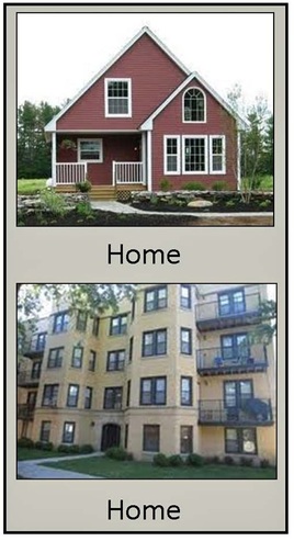
 How do you define your home? Is it your childhood house? Is it wherever you are at the moment? Is it permanent or temporary? What types of objects make a location feel like home? This discussion represents in part the tenants of environmental psychology. I am intrigued by this subject as I have seen too many interior designers ignorant on the topic. They produce less than stellar results when the their standard lies in surface embellishments and not the inner workings of the built environment. I challenge you to go beyond the surface and search your definition of home. You might find a more authentic vision. In this discussion I discover that I am more grounded and more aware of just how important environmental psychology is to my definition of home. My home is the place that gives me shelter and protection. I do not call my childhood home “home”. I lived there for twenty years and my parents for 45 years. I refer to this place as “the home I grew up in” and when my parents were there it was “my parents’ home”. My current living space is an apartment of one thousand square feet. I moved into this mid-town apartment nearly five years ago when I decided to simplify my life by reducing the amount of stuff, eliminating the unwanted baggage, and down sizing the excessive square footage. I was living in a single family suburban dwelling and learned that it was excessive in many ways. Less stuff, less stress, and more life! So true. Before moving I sorted and purged the stuff for several months keeping only what was needed - donated and sold the rest. I prioritized the relevance of items according to necessity and attachment. These are the things that make my apartment feel like home: vintage and current family photos, a great aunt's 100+ year old Eastlake drop front desk, a grandmother's 90+ year old hall tree w/mirror , art purchased during travels, my father’s 1940’s hand cracked ice crusher and Chuck-A-Luck cage, my mother’s 1940’s apple peeler, the dulcimer my father hand built, Noah's Ark bench made by my father and son from our backyard walnut tree, and of course my music and book collection. Also, a series of objects with a memorable connection to my sons; hand thrown ceramic pieces, art in various mediums, personal photographic prints, personal writings, high school football helmet still covered in game day dirt, a national championship high school signature soccer ball and ring. In design programming the last item on the list should be the surface embellishments. In my space these items are precious to me. These objects transformed my etagere into a museum fixture telling my story. These precious items cannot be found online or in a retail establishment. They are my precious moments. These items do not define me. They represent a personal history that comforts my soul. These items make my space come to life more than the store bought furnishings - furniture is functional, precious items create the spirit of the place called home. My home is where I am at the moment. Three points- 1. Interestingly, though I feel like this apartment is home I struggle to call it “home” when speaking to others because of the connection the word “home” has to the concept of the single family dwelling. From a St. Louis perspective home is a single family dwelling. When I say, “I am going home” I hear a white lie. I know this apartment is my home and to ground both mind and body must refer to it as such. 2. I grew up camping with my family and did so with my sons. I recall referring to the tent and campsite as home when on these outdoor adventures. Can you get any more temporary a shelter? Home is about the attachment not ownership. Life will be more at ease if we allow ourselves to get attached. 3. Similarly, my hotel rooms have been called home, i.e., after a long day of museum touring I have said, “I can’t wait to get home to rest.” No matter how far or near, urban or rural, new or old, wherever I sleep for more than a few nights that hotel room and lobby becomes my safe place - my home away from home. I rent - so is my home permanent or temporary? This question is perhaps why I struggle to call this place home even though I feel it is home. It is a built environment that gives me shelter. I feel safe here. It is my home. And though I don't own it I do take ownership of it. Oddly, I call it “permanent for now.” Perhaps permanence is about settling in, getting attached, and not how long you stay. That, dear renters, is a statement that if taken to heart can indeed better your life. Having the ability to pick up stakes is important in this economy where financial security is always at risk. I made the decision to rent so that I could have the ability to pack up and move on whenever my heart desired or pocket book required. This turned out to be a smart decision. Statistics show that the greatest number of job openings are located in high rental populations. Sadly, today home ownership can prevent relocating for the purpose of employment. When searching Google-Image with the word 'home' the results are all, yes all, single family dwellings. We need to redefine our concept of home. Home is not necessarily a single family dwelling nor where we have lived the longest. Home is where we are settled for the moment. Home is not where we will live someday but should be where we live now. Our mind, body, and soul truly needs a place to rest now not tomorrow. This mindset will ease the stress of relocation; across town, across country, to a college dorm or even a summer camp. Understanding this concept of home at a young age will ease the transition as we age and require an assisted living facility or nursing home care. Something we all need to consider. Home is where the heart is. Where is your heart? Share your thoughts by adding a comment below. Recommended reading, " How the Crash Will Reshape America" and what the landscape will look like 50 years from now - http://www.theatlantic.com/magazine/archive/2009/03/how-the-crash-will-reshape-america/7293/ 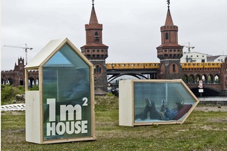 The One Square Meter House Created by Berlin architect Van Bo Le-Mentzel. I love this house and how it messes with our traditional concept of a home. As mobile as any home on wheels this cute one square meter home just might offer the simple life we can all dream of. Indeed, less is more. Does our quality of life really have to be fixed to numbers? Le-Mentzel states, “When you look for an apartment, for example, the first thing you look at is the location, and then at the numbers—how many rooms, how many square meters? But when you really think about it, the square meters say nothing about the quality of the apartment, about the view from the window, how it smells, if the neighbors are nice. These are all things that you can’t put into numbers. So I said, okay, I want to have my own square meter. I want that no one other than I, myself, can decide what happens with this one square meter of mine in the world,” he said. “It’s the only square meter in the world where I can decide what direction the window looks in, what direction the door opens in, what neighbors I have.” http://designtaxi.com/news/352958/Architect-Creates-The-One-Square-Meter-House/
3 Comments
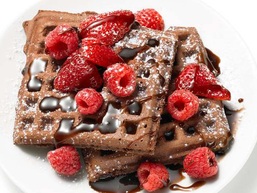 Brown has become a luscious rich color with the influx of Starbucks over a decade ago. And who doesn't love Godiva Chocolates? Start a special breakfast with chocolate waffles topped with red raspberries and chocolate syrup. Decadent! Though appetizing to some tummies I must ask, "How do we visually process brown and red?" Brown is a neutral color, very earthy, and often holds elements of warmth. Red, being a warm color, complements brown, reflects more light creating an energetic balancing act with brown's calmer state. Nervous about using red in your room? Balance it with lots of brown. The brown & red combo makes an unexpected but so jazzy color statement. Easy on the eye and oh so delicious to eat! Hungry for waffles: http://www.foodnetwork.com/recipes/food-network-kitchens/chocolate-waffles-recipe/index.html BROWN RELAXES THE RED EYE.  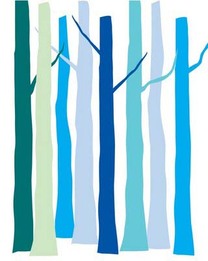 "If you see a tree as blue, then make it blue." Paul Gauguin was well known for his experimental use of color. His strong display of warm colors were often counter-balanced with blue - often out of sync. Placing blue in unexpected forms creates risk and confusion drawing attention that will make a memorable disconnect. Think Blue Man Group! Blue is often portrayed unexpectedly by artist however it is the expected use of blue that more permanently influences our psyche. We are all quite familiar with blue water and blue sky. It is natural. Organic. Easy to live with blue is a favorite color of many. Blue effects us physically. It can be sedating, calming, can ease inflammation, and even lower blood pressure. Blue creates a sense of serenity and respite. It shouts quiet and tranquility. Are we so accustom to sky blue that we are always at ease in its presence? Perhaps it is this organic connection that makes blue such a universal color. It is after all a gender neutral color. Yes, there is "baby boy blue" but all the other blue hues are indeed gender neutral. There are many many associations with the color blue. It represents the highest order of justice, moral behavior, and devotion. The blue ribbon suggests the best in quality, skill and achievement. It is the most used color in corporate logos, identification, and branding. Though blue can suggest a puritan affect it is interestingly considered indecent: blue movie, blue laws, blue devils, blue moods, depressed, and even melancholy. Blues can influence our spaces in many ways. Light to mid-tone blues are open and expansive as the sky. They are optimistic, eternal, enduring, and of course, calming. Darker blues are far more serious, can draw you inward, create a retreat, and encourage creativity. The deeper grayed blues sense turbulence showing a bit of moodiness that can be unsettling - moody blues. Gleaming, shiny, and brilliant are the electric blues that defy the typical "cool" message. The hottest part of a flame is blue! Electric blues glow in glittering fireworks and shimmer with iridescence in exotic sea life. Periwinkle blues, those with purple influence, are the happiest and warmest of all the blues. Periwinkle is perky, fun loving, and quite nonchalant. When choosing blue in your design pay attention to the "mood" of the blue. Are you seeking a calm, quiet, and peaceful space? Might you want a room with that is exhilarating, full of high spirits and energy? Perhaps you are seeking a space that is more professional, thought provoking, and conservative? Well then, you would choose light blue, bright blue, and deep blue in that order. Blues can create diverse moods. They are not all calming. Choose your blue based on the desired purpose, energy specified, and of course, the size of the room. Certain blues can read neutral in a room - our brain processes various shades of sky blues as a common back drop in our vision - so don't be afraid to add some to your palette. Raoul Dufy, a French Fauvist painter, understood the power of blue. "Blue is the only color which maintains its own character in all its tones...it will always stay blue; whereas yellow is blackened in its shades, and fades away when lightened; red when darkened becomes brown, and diluted with white is no longer red, but another color - pink." Blue is always blue! Therefore it is reliable, constant, and dependable. COLOR TASK: Blue is quite diverse. Have you noticed? Considering your own space make a list of the various colors of blues you've used. Give each a name making a notation if it is light, bright, or deep. Attach to each hue a list of words that describe the mood of the blue. Do these words match your intended aesthetics and function? Might you be making some blue changes? A second task: as you travel throughout your day, on the road to, from and in various locations pay attention to the color blue... the many colors of blue.... and ask yourself, "Does that blue make sense for its purpose?"  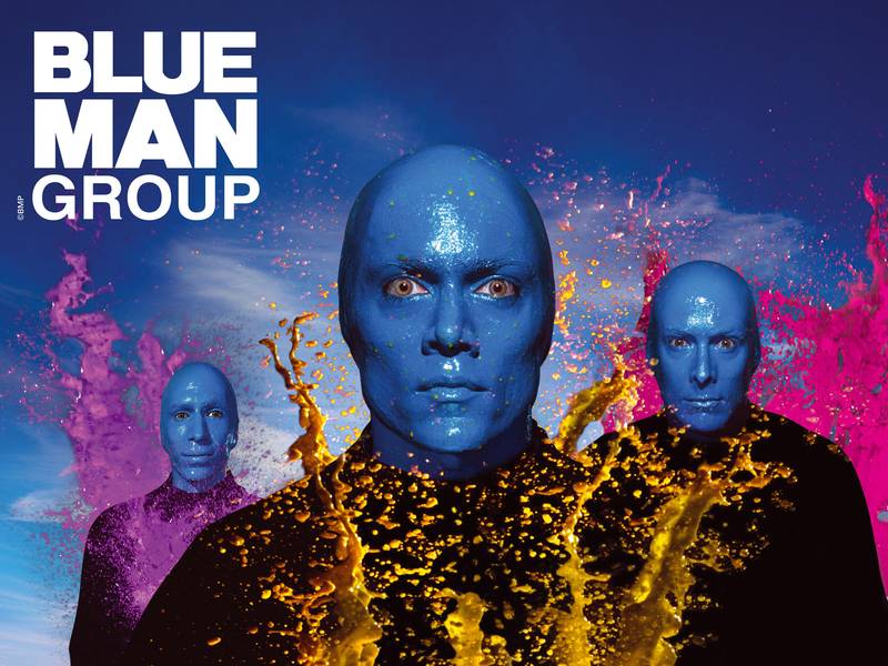  Paul Gauguin "of course" Raoul Dufy
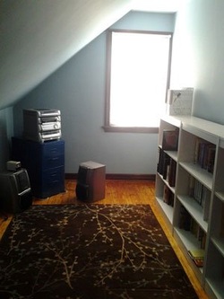 There are lots of design resources on the world wide web. Recently I read a designer's response to a question asked by a homeowner. As an educated designer I find it discouraging that many of the question and answer formats ignore evidence based design elements and principles. The homeowner wrote a lengthy description of an upstair room: the room was just painted, did not want to repaint, and wanted the space to not feel like a cave. (image left) The questions included: Is there anything I can do to make the room brighter without changing the wall color? Should I get more white pieces? One friend suggested a glass desk? Good idea? I was also thinking about adding some orange accents. Would that help or make it worse? The "designer" response was weak, avoided some of the questions, and spent much time suggesting purchases without explanation as to why. The designer response: “I say paint. The reader sounds like a person with an adventuresome spirit and this wall color is rather gloomy. If she is feeling brave, she can consider a rich navy or charcoal accented with a little splash of orange she mentions. Don’t be afraid of the dark! Keep the plastic shelves and paint the window trim the same white. Add a tall, sculptural floor lamp to provide some height and light at the end of the room. She might try something like the Dudero floor lamp from Ikea. She can place a desk below the sloped wall. The idea of a one with a glass top would add sparkle to the room or the Go-Cart desk from CB2 in chartreuse or this year’s go-to-blue would add another splash of color. CB2 has a nice selection of bright desk chairs to top off the deal. A task lamp on the desk will help balance the light in the room and help her to see to pay the bills.Keep the window covering white and as minimal as her privacy standards permit. One of the wonderful rugs from FLOR will crown the graphic concept. Look at “Fuzzy Button” or “Sprial Out." Don’t think 'cave.' Think rich color and crisp accents. I want to visit her when it is finished. Easy-breezy.” This response suggests that the designer did not listen to the client's concerns and questions. This designer simply redesigned the room according to his/her personal preferences. The designer walked all over and ignored the homeowner's personal preference of not wanting a dark room. A good designer is one who does not leave a personal mark on a client's space just a well designed room. As a client you should expect a designer to listen to you, read your personal styling, and understand your lifestyle. This vetting process would then mix the client's personal taste with the elements and principles of design AND the tenants of environmental and color psychology. Any response short of this design methodology is just a personal opinion, not professional advice. Listen carefully to the difference.... My response to this homeowner's dilemma - repeating the questions and drawing a conclusion. Is there anything I can do to make the room brighter without changing the wall color? The light blue wall color reflects close to 80% of the light that shines on it. This is good for creating a visually larger space. Blue compliments the orange floor because these colors are opposite on the color wheel. Blue is not the issue. Blue is obviously your personal preference - that's why you chose it. No need to repaint the walls to get out of the cave. Should I get more white pieces? No need for more white furniture. Instead, the slanted wall should be painted white to make it part of the ceiling - this will add vertical height to the room. Keep the eye up! White reflects 100% of the light and this adds to the brightness needed in a cave. And, painting the slanted wall white is less costly than buying more furniture. More furniture will only tighten up the space. One friend suggested a glass desk? Good idea? Yes, a good idea. A glass desk would not minimize the space, will not add to the visual disturbance, and will not affect the color palette. The size of the desk should be proportionate to the space. Just because it is glass does not mean you can go big. Add an appropriate sized yet functional lamp on the far side of the desk - carries the eye farther into the room. I was also thinking about adding some orange accents. Would that help or make it worse? First, let’s talk about the palette already in the room - blue walls and orange floors. Blue and orange are opposite on the color wheel and therefore cannot be processed simultaneously by the eye. This creates a higher level of energy in the space - something you may not have initially intended - but the floor is there and you already chose the blue so let’s move on. Second, there is another color in the room that needs to be addressed. The rug color, despite being analogous to the orange floor, is pulling the eye down. The dark red is absorbing close to 97% of the light that strikes it. The huge light reflective variation between the dark red and the light blue creates a disconnect that enhances the fact that this is a small space - the eye is forced to look down. If you want to 'feel more space' you must keep the eye up, up, and up. Remove the dark rug. Third, adding orange accents will create a higher energy for reason stated earlier. Depending on the amount, location, and size of orange objects in the room you can add "fun" without making the space smaller. If you give your eye too many different colors and objects to process you will shrink your room. Understand this formula: increased variances = greater visual disturbance = smaller feeling room. Conclusion: Color is the first thing the eye perceives, followed by contrast. In small spaces keep the palette small. Minimize the amount of visual disturbance in the room. You have blue walls and orange floors. That is your palette. Take out the red rug. With the odd shape of the room you may have to create a rug. Buy a piece of painter’s canvas from the hardware store. Cut it proportionate to the room - much longer than wide. This will draw the eye to the window at the farthest end of the room - important concept in small spaces and a way finding strategy. Paint a large scale orange graphic design on the canvas with a tiny bit of blue, i.e., large orange daisies with blue centers. The large scaled design will fool the eye in a small space - a quirky but affective contrast. Get a small glass desk, an orange chair to carry the eye up, and to the left of the window hang a piece of art (to fit space) containing a lot of orange, maybe some blue, and certainly of bit of natural green. Something like this apple green & orange image. Or, create a window dressing using the same graphic colors to achieve the same affect. All rooms, especially those that do not have good views of real nature through the window, should have some plant life to enhance cognitive restoration - preferably live plants. Place a potted plant on the floor in the corner near the wall art with a small up light underneath. This green will repeat the green in the art adding continuity - important concept for small spaces. You can also place small plants on the desk and bookcases. This room will focus on the energetic orange in the heart of the room, pull the eye to the window wall, and give the appearance that the blue walls are fading away. That’s how you minimize the "cave" affect. Now I must ask, "Do you see a difference in the two responses"? How do you want your design questions answered? Do you want a personal opinion or professional design advice? Share your thoughts and comments here.  Several times this week I have been asked what is my personal favorite color. Good question since I do boast that I do not design a client's space built around my personal preferences. The color that tickles my fancy the most is yellow. "Yellow", you say. Doesn't yellow make adults argue and babies cry? Absolutely not! Repeat, absolutely not.
Leatrice Eiseman shared her research in which she busted the urban legend about yellow at the advanced Color & Design seminar that she instructed and I attended. (See blog posting below dated 02.20.2012) "After hearing that [yellow] story once too often, I tracked its source and discovered it was based on false research," Eiseman stated. "Yellow evokes sunshine, warmth, and happiness - not arguments and crying." Retrieving personal color preferences from childhood I have yet to identify any one specific event, location, or attachment I have to yellow. It will come to me one day - when I'm not trying, of course. I do know that I love how yellow makes me feel. My all time favorite yellow thing is the yellow daisy. Yellow daisies have been represented at many important moments and events in my life. Holding on to the center each petal is unique and points in a different direction - with a mission in mind I'm sure. Despite their individuality and position each petal works harmoniously in totality. I love the form and the color - it is a little bit of sunshine. Humans react to and make connections to all colors. Yellow sparkles, is connected to the sun in a way that evokes energy and vitality. A color that represents curiosity yellow enlightens intellectual energy and stimulates the imagination. Never dark or dim yellow is extroverted. Attracted to an infant's eye yellow is important in human development into the toddler years. Yellow light waves stimulate the brain, clears the mind, and encourages decisive action - the reason life feels better on a sunny day. Yellow is the most visible of all colors because it has the highest reflective value. Yellow is often used to draw attention and could be the reason why some people do not like yellow - in its brightest form yellow is not calm and is not introverted. Yellow represents originality and resourcefulness of an open mind. It is joyful, hopeful, and carries an air of optimism. Yellow grabs our attention and is often used in signage, packaging, and points of purchase. Yellow is found in our favorite comfort foods in mellow yellow shades: mac & cheese, french fries, and chardonnay. Soft golds are pleasant and relaxing - and pairs nicely with ocean blues. And least we forget, yellow shines in metallic gold hues reflecting sophistication, wealth, and luxury. Add a metallic shimmer and the gold tone blankets the room in warmth. See Benjamin Moore's Hollywood Gold #279. http://www.benjaminmoore.com/en-us/for-your-home/color-gallery?cd=279&col=CC#ce_s=holly What's not to like? Do you have some form yellow in your life? COLOR TASK: With spring time blooming find yourself a FRESH bouquet of flowers - daisies if you choose. Without making a fuss place the flowers loosely in a vase allowing the stems to roll off the top. Keep it casual and unstructured. Let the color speak to you. Set the vase in your kitchen window or your bathroom counter top - a space that you frequent and would not normally place fresh flowers except when you entertain. Make note of your internal reaction each time you walk into the room. Take a calm breath, sniff the fragrance, and enjoy your day.  Color-Blind Artist Neil Harbisson Uses Webcam-Like Eyeborg to ‘Hear’ Color
There is the art of color and then there is the science of color. Gerry Hadden from PRI's The World submitted this story about a 28 year-old born without the privilege of seeing color. Neil Harbisson did not let his fascination with the absence of color in his life stop him from understanding the science of color. Read, see and listen to his story. This reminds me that seeing color is indeed a privilege and highlights just how significant the power of color is - even for those who don't see it. photo: by Gerry Hadden Leatrice Eiseman  January 2012 was a month full of colorful education. I attended the Eiseman Center for Color Information and Training program staged in beautiful downtown Burbank, California. In an effort to further advance my knowledge in the art and science of color I sought out the leading color expert, Leatrice Eiseman – Executive Director of Pantone Color Institute, a member of ASID and IDSA, chair holder of the Color Marketing Group, and the list goes on. Her color selections for various industries have won numerous awards including an award from Industrial Design Magazine for the newest group of colorful Leatherman Utility Tools called “Juice” and Schick Women's "Intuition" Shaver. (see images below) She has authored five color books, has been quoted in numerous international publications, and has appeared on TV and radio talk shows throughout the world. Leatrice advises color marketing groups for many national and international companies. She selects Pantone's color of the year (2012 Tangerine Tango) and names the top ten fashion colors twice a year for Women's Wear Daily – and now men’s colors too. Eiseman is the go to colorist for understanding color and its influential power. I am so excited and honored to have worked with Leatrice Eiseman – I am learning from the best. In Burbank I explored professional color systems, retail color management, product color specifications, the emotional power of color influencing, attended workshops on color combinations, discussed advanced color techniques including color naming and specifying, and learned the how-to's of color forecasting from Eiseman and was able to walk away from this intense color training with a fortified foundation of color knowledge that can be applied to ALL built environments. Having studied the psychology of color in my undergraduate program, writing my thesis on the topic, I learned early on that a successful designer and merchandiser must have a strong understanding of color: art, science, and psychology. With this strong foundation, years of practical experience, and a skilled eye I received credible and veritable information based on the emotional aspect of color. In the coming weeks I will be adding writings to this blog on the topics discussed in my advanced Color/Design training. I will be happy to share my knowledge with you and give you a COLOR TASK. Check back to see what you can learn. EMOTIONAL RESPONSE TO COLOR During the training I was given the latest information on the emotional messages and meanings of each color family. As humans we respond on a subconscious level to color - most of the time. (see appetite response in Power of Color blog below dated 02.08.12) Our psychological responses to colors range from a state of tranquility to that of agitation, in varying degrees and are usually developed in childhood. As children we develop attachments to color based on three diverse influences: sad, happy, or trauma. It is quite typical that if we love a particular color it has a happy association from childhood. If we hate a particular color there is certainly a deep negative often traumatic attachment to it. Is there a color that agitates you? What is your negative association to that color? Me? I love all color, or so I thought. While taking the color word association quiz in class I struggled to respond negatively to any of the 38 colors listed however when I pushed myself I finally marked a negative response to the color burgundy. My word association to burgundy was stubborn. Eiseman was puzzled by my response. As the other class participants discussed their quiz results I just could not make an emotional connection to mine. Eiseman stated, "the recognition of the negative association may take a long time to surface." My association surfaced in class while another colorist was discussing hers. Bingo! Of course, it was high school. While attending a parochial school I was required to wear a uniform. Can you guess what color uniform? Yes, it was burgundy, a herringbone woven skirt with two inverted box pleats in front and back, worn with a burgundy cardigan sweater, and burgundy knee socks. The stubborn association stems from the social and structural environment of a private high school of those days - strict religious influence accompanied with a heavy dose of gender inequality - I was not allowed to take a mechanical drawing class because I was not a boy. My attempts to convince the administration that this gender rule was unfair and unethical proved to be a waste of time - they were simply stubborn. Disturbing then and now! To this day I believe that if I had taken the mechanical drawing class I just might be designing bridges and buildings today. I prevailed however in another field harnessing my creative spirit in the interior design of built environments using the tenants of environmental and color psychology – elements well beyond the simplistic surface embellishments we often use to “decorate” our spaces. Understanding the disconnect that I have had with the color burgundy I will now be able to specify its use in my personal space should it be the perfect hue to complete a well designed color palette. I don't have to avoid it or be afraid of it any more. Yes! The reason for understanding your negative association with a particular color is important. First, recognize it, acknowledge it, and realize that it is not the color that agitates you but the association that you have with it. So, when your friend loves the color that you hate please please do not voice your opinion when your friend is choosing the color for their own space. Perhaps your friend has an incredibly fond happy memory attached to a favorite grandmother and enjoys the comfort of living with that color. Color preference is personal simply due to our emotional attachments to them and not so much to the popular color trends of the day. Know that your emotional attachments are important, unique and should NOT be influential in a space that you do not live or work in. COLOR TASK: Sit for a quiet moment in one of your home or work spaces, decide if you like being in the space. Then determine if it is a particular color that you see that does not resonate with your own emotional attachments: happy, sad, or traumatic. Forget about the color trends, forget about HGTV, forget about "the decorator", forget about your mother, sister, and friend. This is about YOU and YOUR attachment, not theirs. Of course those actually living in your space should weigh into the color specifications - especially if it is their own personal space within. If the color in your room is not right, well then, you need a colorist - call me, we'll talk. Share your unique color preference or lack of and its attachment in "add comment" below.  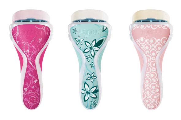 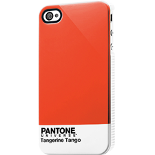 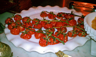 Red, red, red. Red is out there. Red tugs and pulls on our senses and psyche. In pure form it is bold and physical. It gives us life. It makes our heart pump. It releases adrenaline. It represents life sustaining blood. It arouses our appetite. It arouses our sensual side. So why are we so afraid of red? Why do so many of us see red paired with green and just think Christmas? Spending a lovely evening at Osteria Mozza in Los Angeles was an experience never to be forgotten. I sat at the Mozzarella Bar viewing the culinary creations of Mario Batali and his partners come to life while I savored my dinner. (see below for my dining selections.) The u-shaped counter top was lined with colorful ingredients used in the recipes from the mozzarella menu: whisper whites gleamed from the three mozzarellas, bronze spiced walnuts, banana creamed colored pine nuts, deep cactus colored fried rosemary, a green rainbow of olives, raspberry colored currants, bacon reflecting tones of brown sugar and apple cinnamon, honey and amber gold tones glimmered from the fresh honey-comb, clean ecru tones softened the Parmigiano Reggiano, with zesty green mint pesto, just to name a few. In front of me sat this gorgeous plate of roasted cherry tomatoes on the vine. The natural bright reds of these succulent tomatoes were so appetizing. Clinging to the vine the red of the fleshy tomato was complimented by the green of the vine. Each making the other more brilliant. (That's what complimentary colors do.) I was not reminded of Christmas. I saw veggies loaded with healthy antioxidants. Oh so appetizing! Hey, it is time to stop the Christmas association with red and green. Unprocessed red foods are healthy and green adds a restful restorative component to our psyche - why we love going to the park. It is time to see red and green for what they are - colors found in nature that can bring a healthy approach to our built environments. Can't handle the boldness of pure red? Then bring it down with a bit of brown and/or blue creating paprika, cranberry, baked apple, or tandori spice. All delicious and easy to live with. Grab some red and feel your senses come to life. Where is the red in your life? Living Color in food! Baby Kale with pine nuts, ricotta salata & marinated anchovies Burrata with bacon marinated escarole & caramelized shallots Tagliatelle with oxtail ragu Wine selection Morellino di Scansano La Mozza "I Perazzi" - Toscana | 200 http://www.osteriamozza.com/LA/home.cfm photos: private collection gfhayes  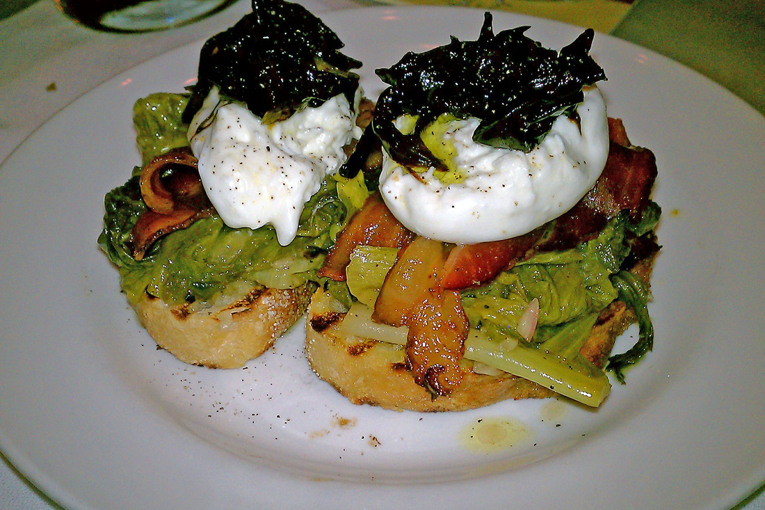  I recently visited a local retail mall not to shop but to observe the psychology of its environments. I decided to pick six gender-specific stores and compare both the internal color schemes and the store layouts. I wanted to explore the visual impact of each space. How are they similar? What are the contrasts? Do retailers use the psychology of color to entice us to stay inside their stores longer and to spend more dollars? I visited the Galleria Mall in St. Louis, Missouri. There are close to 110 stores in this mall with the selection of stores being pretty much the standard fair for a suburban mall in a healthy social-economic community. The anchor stores are Macy’s and Dillard’s with Nordstrom’s opening this past fall. http://www.saintlouisgalleria.com/ The women’s’ stores and the men’s stores were different in style and with some variation in color. The women’s stores were very white with no wall color allowing the product sold to be the focus of attention. The men’s stores had neutral walls with a strong focal color. The men’s stores color of choice was strong warm reds and oranges. All six stores used very neutral color on walls and floors. Five of the stores used no patterns anywhere and the jewelry store used some metallic pattern back drops but these were subtle in color. In walking the mall I noticed many other stores extensive use of white. Except for Brooks Brother’s classic style most stores had little or no theme. They were basically empty boxes with product to sell. The Coach Store sells high end designer handbags. The store front was framed in white with polished chrome trim. The interior space was white with no patterns represented with a scattering of mid-maple wood tones. The floor was neutral. Display fixtures were white. The cash wrap sat to the back of the store with the signature Coach logo used as a back drop. Two lounge chairs in neutral tones sat on top of a brown area rug centered in front of the cash wrap. The merchandise was visually prominent because of the white scheme. This space was all about the product - raising the importance of a functional item to a high fashion accessory. The Swarovski Store sells precisely-cut lead crystals set into various styles and types of jewelry. The exterior is all glass with a header of brushed nickel. The interior is all white and soft off whites layered throughout the store. Fixtures are white and chrome. The cash wrap was set towards the back against the right wall. The signature swan sparkled on a door cabinet behind the cash wrap. Subtle metallic patterns were visible of a few vertical panels. The floors were a putty tile. The merchandise was visually prominent set against the white back drop with carefully arranged spot lighting. Focal points were evident with easy transition possible throughout the space. Open space inside the doorway created an invitation to passing shoppers to step in without confrontation. White House Black Market is a ladies clothier. It first opened in 1997 has a combination of two stores selling only white and black merchandise. Though the core line is still shades of black and white other colors have been introduced. The exterior is glass framed in black. The interior has shades of white on the walls and floor. The fixtures are black and bronze tone. The windows are lined with mannequins. The cash wrap was located just off the center of the store with no signage identifying its location. There were no specific color stories. This created a disorganized cluttered space that lacked any focal direction. Brooks Brothers is a men’s fine clothier. The exterior of the store is white stone with black awnings over the windows. The interior of the store has shades of white with dark wood cabinetry used for display. The floor is a combination of medium stained hardwood and neutral stone. The classic men’s clothing showed well in and on the dark cabinetry as did the bright colored casual wear. The cash wrap was set off center to the left side of the focal display wall containing the fireplace. Navigation through space was easy. Johnston & Murphy is a specialty men’s shoe store that does offer some clothes. The exterior of the store was glass framed in dark wood tones. The primary wall color was off white with an orange red focal color off center to the back of the store. The cash wrap sat directly in front of the focal wall. The only other colors in the space are the six red chairs placed just toward front center. The fixtures were satin finished nickel with faux wood tops. The cash wrap was very visible because of the bright colored wall behind it. Though there was a lot of merchandise the color stimulation was low because classic men’s shoes are not brightly colored. There is easy navigation all around. Lorenzo is a men’s clothing store with casual contemporary styles. The exterior is glass with door framed in a metallic silver tile. The interior walls were ivory toned with a bright red orange focal point on the back wall. The carpet was a textured gray color. The fixtures were a mix of dark wood, bronze, and black laminate. The cash wrap desk did not sit in front of the focal wall but perpendicular to the right side. Clothes were more neutral and soft in color and did not attract specific attention upon entry. Navigation was easy. Buckle B is a men’s store that recently opened. I found yet another men’s store using a red/orange color on the back wall to draw attention to the rear of the store. Red is high in energy, can speed up the pulse, increase respiration, and raise blood pressure. “Red is associated with fire, heat, and blood. Key words associated with red are winner, achiever, intense, impulsive, active, competitive, daring, aggressive, and even passionate.” (Eiseman, 2003, p. 29) These words reflect the image that men’s stores want to project to attract male shoppers. The only women’s store that had any color on the wall was a store named Love Culture. There was so much visual stimulation walking by this store that I stopped and stared. Of course the eye is drawn to the red wall displaying handbags and the pink wall displaying hats. The target market is probably the 13 to 20+ year old girl. Being youth oriented the energy level was high. I was hesitant to enter this store by the clothing displayed right at its doorstep - visual clutter discourages passage. The more mature women’s stores were calm with low energy making it easy to shop for longer periods of time. Other women’s store using white as its primary color: Bare Escentuals and Pandora It is evident that these retailers have methodically relied on evidenced-based design strategies when creating their brand. The womens' stores clustered on clean lines with strong use of white while the mens' stores relied on the masculine energetic colors of reds and oranges. The stores that I felt most comfortable in had a clear sight line to the back of the store, wide aisles with plenty of spacing between racks, and a gentle interior color palette allowing my eyes to process product color more accurately. Let's face it - when in a store if we feel agitated by poorly selected color schemes, if we feel as though we must work hard to see the product and then must step over other product to touch it, well, odds are we won't be swiping the credit card in that store. The stronger retail operators understand environmental psychology. And who are those that don't? This answer you already know. Eiseman, L. (2003). The Color Answer Book. Herndon: Capital Books, Inc. Kopec, D. (2006). Environmental Psychology for Design. New York: Fairchild Publications. Left vs. Right retrieved from http://web-us.com/brain/LRBrain.html 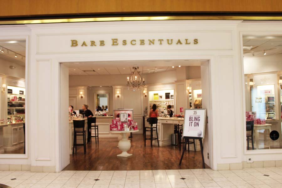 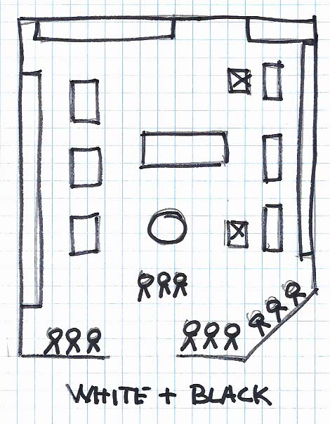  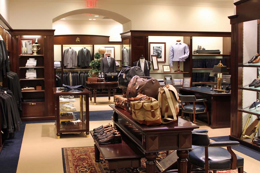 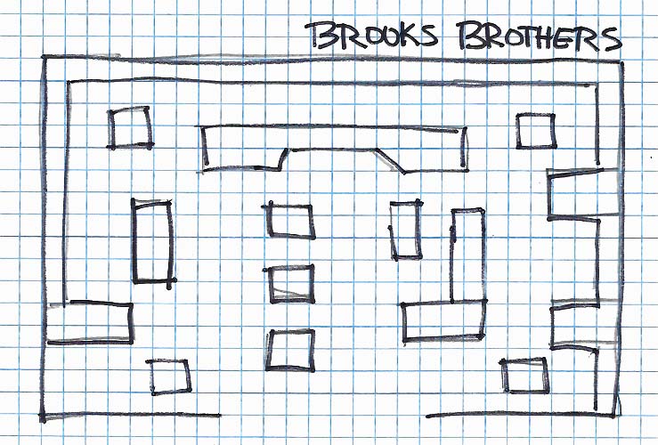 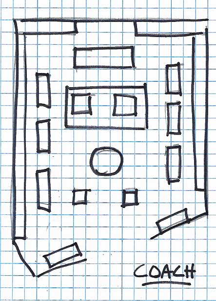 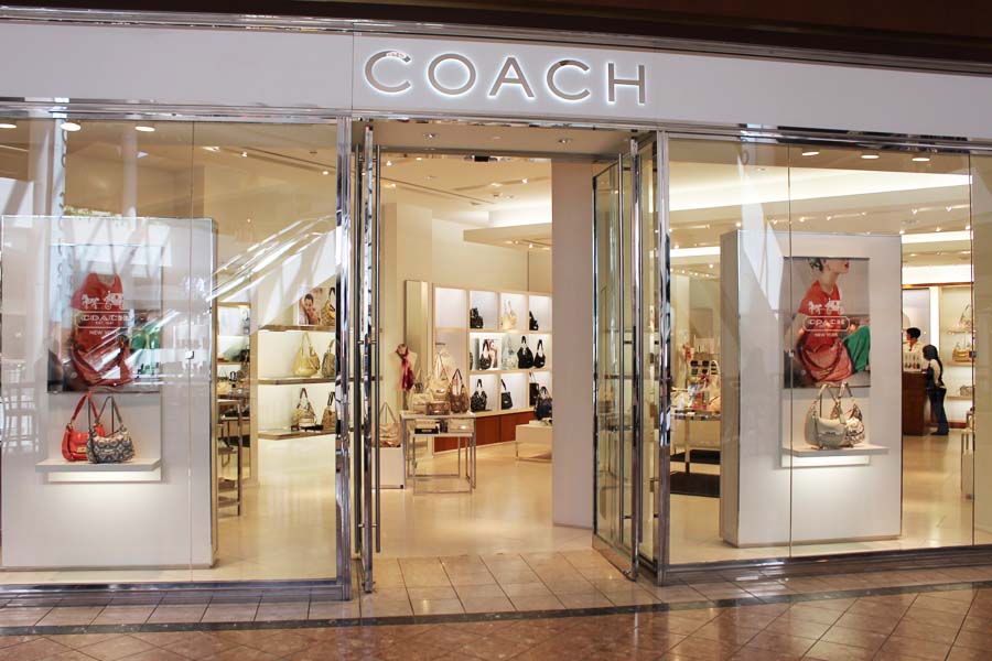 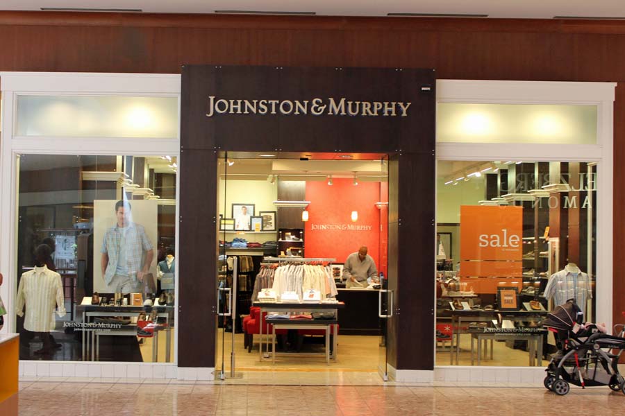 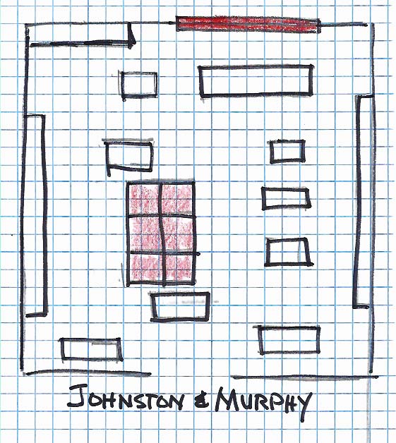  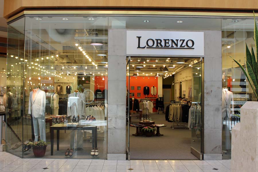 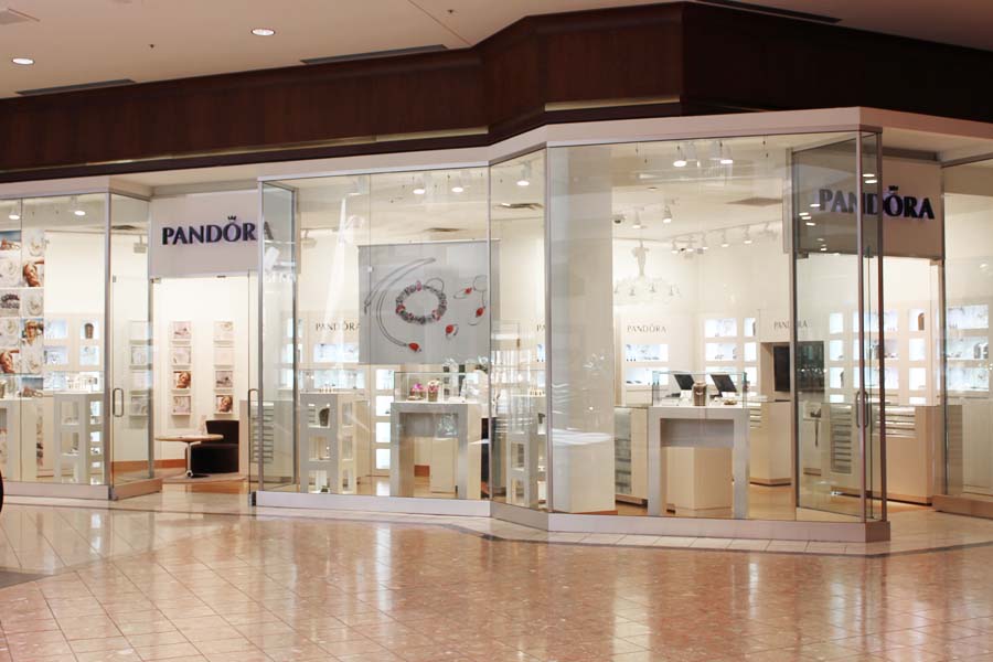 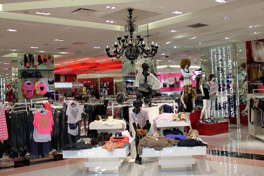 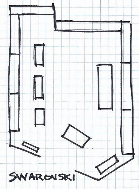 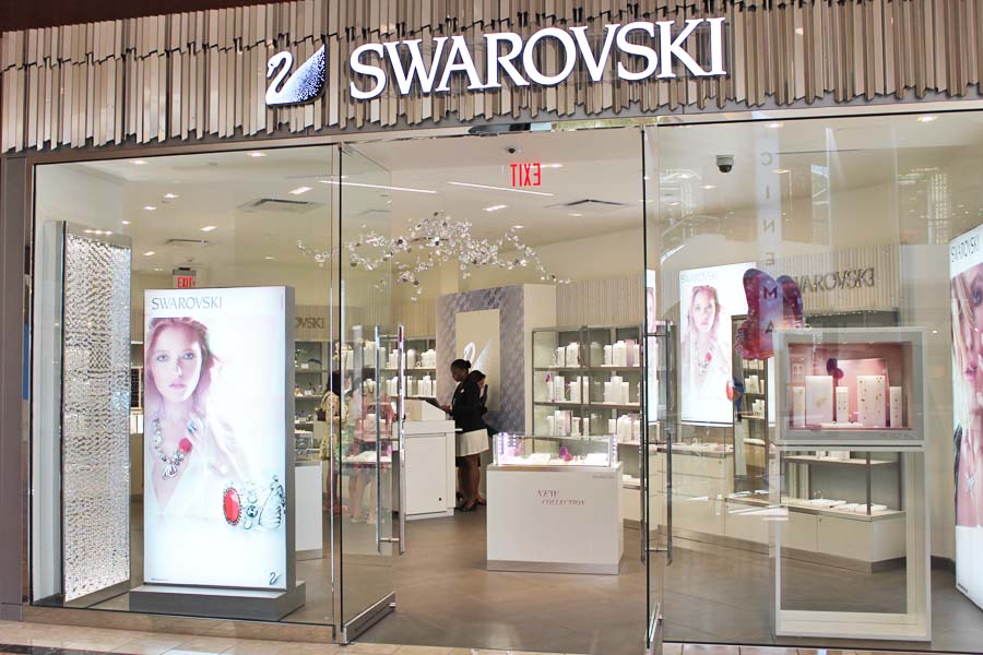 This week I spent time in a law office discussing options for an updated reception area. Scattered about the space were upholstered and case good pieces that came into the space by default not design. Sitting in the corner at a strong angle was a cordovan leather sofa that all in the discussion tagged as old, dated in style, and ready to be removed. In a room of over-styled dated pieces sat a classic sofa in magnificent condition - The Chesterfield. Classic in design with a significant connection to a man's world the Chesterfield Sofa has made a come back. The style cycle continues to bring back great classics that can now be found in the local retail furniture showrooms, mall lifestyle stores, and internet sellers. My curiosity was aroused and I searched to refresh my knowledge on the Chesterfield sofa. The English Chesterfield Company based outside Manchester England offers a solid story line for the Chesterfield. http://www.english-chesterfields.co.uk/home The Chesterfield sofa conjures images of formally attired gentlemen sequestered in a dark paneled study, sipping brandy and smoking cigars. Throughout history the Chesterfield sofa has come to represent many things to different people. The Victorian era saw the Chesterfield as the key piece in living rooms, where gentlemen relaxed while their wives sat in chairs crafting needlepoint. Since the 19th century, it has been linked with Freudian psychoanalysis, as Sigmund Freud originally used a sofa during his hypnosis sessions with patients. Flash forward two centuries and find yourself seated in a sumptuous red leather Chesterfield in a dark corner of a local coffeehouse or wine bar. Throughout the years, Chesterfield sofas have graced the palaces of royalty, prominent business offices, hotels, restaurants, gentleman's clubs and luxurious private homes. Today the Chesterfield is synonymous with elegance and class in interiors all over the world, of every architectural and decorating style. Regardless of what it represents to many, the Chesterfield steadfastly remains the sofa that embodies the perfect blend of comfort and sophistication. The Chesterfield sofa, however, has a somewhat uncertain history. This icon of the furniture world is widely thought to have been commissioned by, and consequently named in honor of, the fourth Earl of Chesterfield, Philip Dormer Stanhope, in the 18th century. Aside from being a much-admired politician and writer, the suave Earl was a known trendsetter. When the Earl requested a cabinetmaker to construct a piece of furniture that would allow a gentleman to sit upright in the utmost of comfort, thus was the inception of the Chesterfield sofa with its characteristic deep buttoned upholstery, rolled arms, equal back and arm height and nail head trim. There has never been any solid confirmation of this noble beginning. However, this namesake is certainly appropriate. Stanhope was a noted writer of letters to his illegitimate son, extolling all method of manners and morals. The Chesterfield sofa is certainly a refined and mannerly example of seating. Today the Chesterfield can be readily found at many accessible locations including Restoration Hardware, Pottery Barn, and Dering Hall website. I am excited that the partners in this the law office agreed to keep the Chesterfield in its reception room. We will create a space that is warm, inviting, and most importantly a space that is calm and restful giving clients the opportunity to reflect on the purpose of their visit. 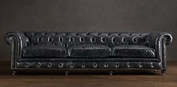 Restoration Hardware has been a big fan of the Chesterfield style for years and it now takes a prominent place in the redesign of the RH brand. Labeled the Kensington the RH version is found in five sizes (76" - 163") with ten leather options - priced from $3,495 to $10,995. http://www.restorationhardware.com/catalog/product/product.jsp?productId=prod550004&categoryId=cat1661032 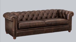 Pottery Barn offers one option in the Chesterfield with no options. At 96" long this Chesterfield is priced at $2799 in a warm cocoa color. http://www.potterybarn.com/products/chesterfield-leather-sofa/?pkey=e|chesterfield%2Bleather%2Bsofa|1|best|0|1|24||1&cm_src=PRODUCTSEARCH||NoFacet-_-NoFacet-_-NoMerchRules-_- 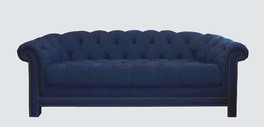 Los Angeles designer Susan Fellman reinvents the classic Chesterfield by covering it in a classic denim. The 13 oz pre washed and stabilized cotton indigo denim adds a user friendly option to the traditional leather Chesterfield. With a barrel back and rolled shoulders this sofa offers brass or nickel head detail. Bench made this sofa is a sound investment at $7,500.
http://www.deringhall.com/products/denim-chesterfield |
AuthorGeri loves to consume color through art, architecture, photography, and interior spaces of all built environments. She is a museum enthusiast. Exploring new places, cultures, and restaurants will always be a part of her life. Geri loves the creative process of cooking with natural fresh local ingredients and adores the beauty of colorfully plated food. 
Archives
July 2021
|
 RSS Feed