|
I recently visited a local retail mall not to shop but to observe the psychology of its environments. I decided to pick six gender-specific stores and compare both the internal color schemes and the store layouts. I wanted to explore the visual impact of each space. How are they similar? What are the contrasts? Do retailers use the psychology of color to entice us to stay inside their stores longer and to spend more dollars?
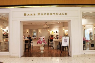
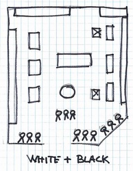
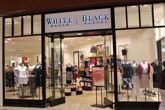
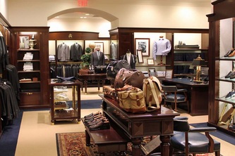
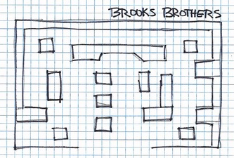
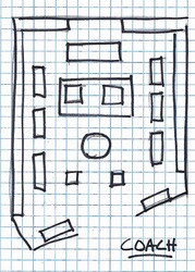
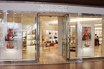
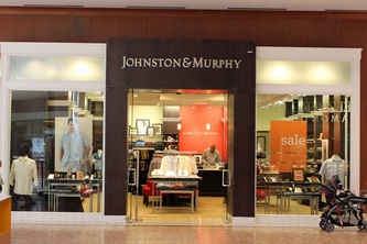
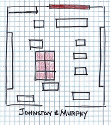
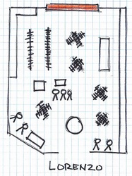
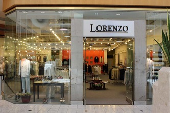
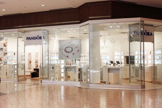
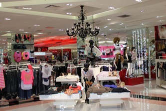
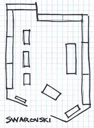
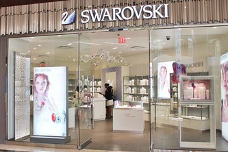
I visited the Galleria Mall in St. Louis, Missouri. There are close to 110 stores in this mall with the selection of stores being pretty much the standard fair for a suburban mall in a healthy social-economic community. The anchor stores are Macy’s and Dillard’s with Nordstrom’s opening this past fall. http://www.saintlouisgalleria.com/ The women’s’ stores and the men’s stores were different in style and with some variation in color. The women’s stores were very white with no wall color allowing the product sold to be the focus of attention. The men’s stores had neutral walls with a strong focal color. The men’s stores color of choice was strong warm reds and oranges. All six stores used very neutral color on walls and floors. Five of the stores used no patterns anywhere and the jewelry store used some metallic pattern back drops but these were subtle in color. In walking the mall I noticed many other stores extensive use of white. Except for Brooks Brother’s classic style most stores had little or no theme. They were basically empty boxes with product to sell. The Coach Store sells high end designer handbags. The store front was framed in white with polished chrome trim. The interior space was white with no patterns represented with a scattering of mid-maple wood tones. The floor was neutral. Display fixtures were white. The cash wrap sat to the back of the store with the signature Coach logo used as a back drop. Two lounge chairs in neutral tones sat on top of a brown area rug centered in front of the cash wrap. The merchandise was visually prominent because of the white scheme. This space was all about the product - raising the importance of a functional item to a high fashion accessory. The Swarovski Store sells precisely-cut lead crystals set into various styles and types of jewelry. The exterior is all glass with a header of brushed nickel. The interior is all white and soft off whites layered throughout the store. Fixtures are white and chrome. The cash wrap was set towards the back against the right wall. The signature swan sparkled on a door cabinet behind the cash wrap. Subtle metallic patterns were visible of a few vertical panels. The floors were a putty tile. The merchandise was visually prominent set against the white back drop with carefully arranged spot lighting. Focal points were evident with easy transition possible throughout the space. Open space inside the doorway created an invitation to passing shoppers to step in without confrontation. White House Black Market is a ladies clothier. It first opened in 1997 has a combination of two stores selling only white and black merchandise. Though the core line is still shades of black and white other colors have been introduced. The exterior is glass framed in black. The interior has shades of white on the walls and floor. The fixtures are black and bronze tone. The windows are lined with mannequins. The cash wrap was located just off the center of the store with no signage identifying its location. There were no specific color stories. This created a disorganized cluttered space that lacked any focal direction. Brooks Brothers is a men’s fine clothier. The exterior of the store is white stone with black awnings over the windows. The interior of the store has shades of white with dark wood cabinetry used for display. The floor is a combination of medium stained hardwood and neutral stone. The classic men’s clothing showed well in and on the dark cabinetry as did the bright colored casual wear. The cash wrap was set off center to the left side of the focal display wall containing the fireplace. Navigation through space was easy. Johnston & Murphy is a specialty men’s shoe store that does offer some clothes. The exterior of the store was glass framed in dark wood tones. The primary wall color was off white with an orange red focal color off center to the back of the store. The cash wrap sat directly in front of the focal wall. The only other colors in the space are the six red chairs placed just toward front center. The fixtures were satin finished nickel with faux wood tops. The cash wrap was very visible because of the bright colored wall behind it. Though there was a lot of merchandise the color stimulation was low because classic men’s shoes are not brightly colored. There is easy navigation all around. Lorenzo is a men’s clothing store with casual contemporary styles. The exterior is glass with door framed in a metallic silver tile. The interior walls were ivory toned with a bright red orange focal point on the back wall. The carpet was a textured gray color. The fixtures were a mix of dark wood, bronze, and black laminate. The cash wrap desk did not sit in front of the focal wall but perpendicular to the right side. Clothes were more neutral and soft in color and did not attract specific attention upon entry. Navigation was easy. Buckle B is a men’s store that recently opened. I found yet another men’s store using a red/orange color on the back wall to draw attention to the rear of the store. Red is high in energy, can speed up the pulse, increase respiration, and raise blood pressure. “Red is associated with fire, heat, and blood. Key words associated with red are winner, achiever, intense, impulsive, active, competitive, daring, aggressive, and even passionate.” (Eiseman, 2003, p. 29) These words reflect the image that men’s stores want to project to attract male shoppers. The only women’s store that had any color on the wall was a store named Love Culture. There was so much visual stimulation walking by this store that I stopped and stared. Of course the eye is drawn to the red wall displaying handbags and the pink wall displaying hats. The target market is probably the 13 to 20+ year old girl. Being youth oriented the energy level was high. I was hesitant to enter this store by the clothing displayed right at its doorstep - visual clutter discourages passage. The more mature women’s stores were calm with low energy making it easy to shop for longer periods of time. Other women’s store using white as its primary color: Bare Escentuals and Pandora It is evident that these retailers have methodically relied on evidenced-based design strategies when creating their brand. The womens' stores clustered on clean lines with strong use of white while the mens' stores relied on the masculine energetic colors of reds and oranges. The stores that I felt most comfortable in had a clear sight line to the back of the store, wide aisles with plenty of spacing between racks, and a gentle interior color palette allowing my eyes to process product color more accurately. Let's face it - when in a store if we feel agitated by poorly selected color schemes, if we feel as though we must work hard to see the product and then must step over other product to touch it, well, odds are we won't be swiping the credit card in that store. The stronger retail operators understand environmental psychology. And who are those that don't? This answer you already know. Eiseman, L. (2003). The Color Answer Book. Herndon: Capital Books, Inc. Kopec, D. (2006). Environmental Psychology for Design. New York: Fairchild Publications. Left vs. Right retrieved from http://web-us.com/brain/LRBrain.html
1 Comment
julie
2/9/2013 02:19:59 am
bare escentuals in holyoke,ma has pink walls. nice lighting, wall color and lighting are very flattering to the skin. would love to use it in a powder room, if only I could find out the color
Reply
Leave a Reply. |
Details
AuthorGeri loves to consume color through art, architecture, photography, and interior spaces of all built environments. She is a museum enthusiast. Exploring new places, cultures, and restaurants will always be a part of her life. Geri loves the creative process of cooking with natural fresh local ingredients and adores the beauty of colorfully plated food. Archives
July 2021
|
 RSS Feed